There is a particular kind of hush that falls over a room when a classical painting really works. You might not know why at first. Your shoulders drop. Your eyes settle. You feel guided, almost gently escorted, from one part of the canvas to the next.
That feeling is not an accident. It is composition, the underlying choreography of shapes, values, lines, and attention. If subject matter is the story, composition is the stagecraft. It decides where you stand, what you notice first, and how long you linger.
This guide is here to make composition feel less like a secret handshake and more like what it truly is: a set of learnable tools master painters used to create clarity, drama, and emotional weight.
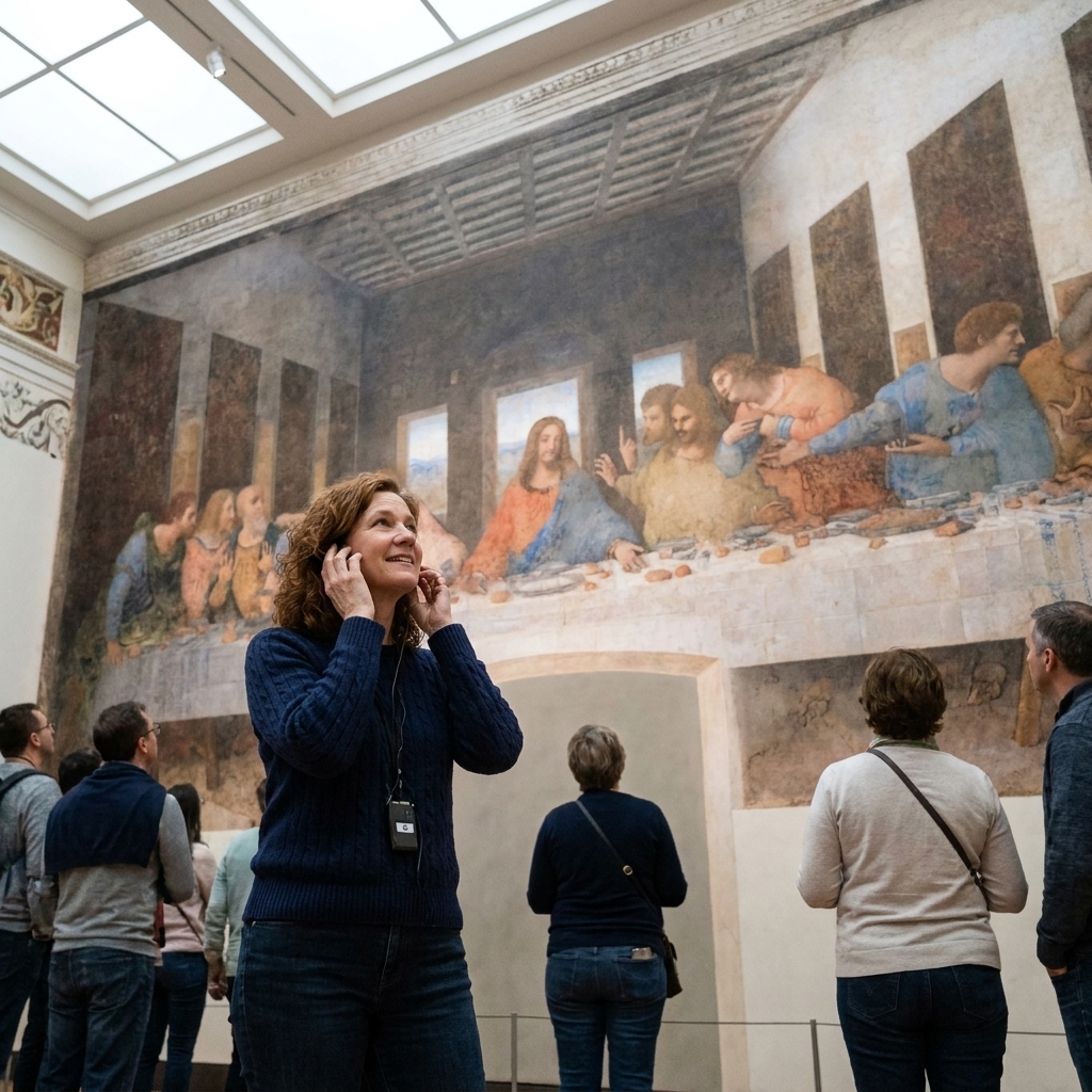
What composition does
Composition is the arrangement of everything you can see: figures, architecture, landscape, light, dark, color, and even the empty spaces in between. In classical painting, composition tends to do four jobs at once:
- Creates a focal point so your eye knows where to land.
- Organizes movement so your eye knows where to travel next.
- Balances the picture so it feels stable, intentional, and complete.
- Supports meaning so the emotional message is reinforced, not diluted.
When people say a painting feels “harmonious” or “dramatic,” they are often responding to compositional choices long before they can name them.
Read a painting in 60 seconds
If you are standing in front of a painting and want a quick compositional read, try this little ritual. I do it all the time, even when I am pretending I am just casually browsing.
- Find the first thing you noticed. That is the likely focal point.
- Trace your eye’s path. Where do you go second, third, fourth?
- Squint. Watch the painting flatten into big shapes of light and dark. That’s the value structure.
- Check the edges. Do you feel “held” inside the frame, or does the image leak out?
Now let’s talk about the tools that create those effects.
Focal points
A focal point is not always the biggest figure. It is the most visually “insistent” area, the one that calls for your attention. Painters had a full toolkit to make that happen.
Contrast (especially light against dark)
Our eyes love contrast. Put a bright face against a deep shadow and you have an instant beacon. This is one reason Baroque painting can feel like stage lighting: the spotlight effect is compositional, not just theatrical.
Edges and focus
Hard edges and crisp detail pull attention. Softer edges let areas recede. Even if you are not consciously tracking it, your eye is constantly ranking sharpness.
Placement: the power of “almost center”
Dead-center can feel static. A common approach is to place the main figure slightly off-center, then stabilize the rest with balancing shapes. That small asymmetry creates life without chaos.
Gesture and gaze
In figurative painting, people can become arrows. A turned head, an outstretched hand, a cluster of figures looking in the same direction. Artists use bodies to point at what matters, sometimes more effectively than any line could.
Leading lines
Leading lines are any visual paths that guide your attention: roads, rivers, drapery folds, spears, architectural edges, even the tilt of a shoulder. They are called “lines,” but they can be implied rather than drawn.
Perspective
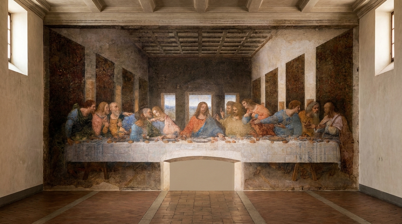
Many Renaissance painters eagerly explored linear perspective, but the point was not math for math’s sake. Perspective organizes space so the viewer’s eye can travel cleanly into depth. In many works, converging lines steer you toward the main subject, or toward the place the artist wants to feel most “important.”
The S-curve
In landscapes and mythological scenes, a gentle S-shaped pathway or river can slow the eye down in the best way. It creates a sense of wandering, like being invited deeper into the world of the painting.
Diagonals
Diagonal compositions feel active because they resist stability. Many Baroque paintings use diagonals to make action and emotion feel immediate, like the scene might tip into our space.
Balance
Balance is not only about mirroring left and right. It is about how “heavy” elements feel. A dark mass can outweigh a light one. A bright red accent can counter a large muted area. A single face can balance an expanse of architecture because we are wired to prioritize people.
Symmetry
Symmetry is a classic move for sacred or formal subjects. Think altarpieces and portraits designed to feel stable, dignified, and outside ordinary time.
Asymmetry
Asymmetry is where composition starts to breathe. A group of figures on one side can be balanced by open sky on the other, if the sky is luminous enough, structured enough, or punctuated with a single strategic detail.
Triangles
If you hear one “rule” about classical painting, it is probably triangles. Triangular groupings are stable, readable, and flattering to the human figure. They also create a subtle hierarchy: the apex often signals importance, while the base grounds the scene.
Value
Value is the range from light to dark. If composition is choreography, value is the lighting plot. It is also one of the fastest ways to understand why a painting feels legible from across a room.
Try the squint test
When you squint, details blur and value shapes become clear. Strong compositions often reduce into a few large, intentional value masses, not confetti-like specks of unrelated tones.
Chiaroscuro and tenebrism
Chiaroscuro is a broad use of light and shadow, both to model form and to organize the overall pattern of the painting. Tenebrism pushes the contrast further, with large areas of darkness and a concentrated, dramatic light source, often associated with Baroque painting. Both are compositional strategies as much as stylistic ones: they tell your eye where to go.
Color
Color is not decoration in classical painting. It is another steering wheel.
Warm vs. cool
Warm colors (reds, oranges, golds) tend to advance, while cool colors (blues, blue-greens) tend to recede. A warm face against a cooler background can quietly become a focal point even without extreme value contrast.
Saturation
Highly saturated color pulls focus. Muted passages act like supporting actors, keeping the main moment clear. A single bright note, a crimson sash, a blue mantle, can stitch a whole scene together by repetition.
Space
Classical painters are often excellent hosts. They do not just show you a scene, they place you in it.
Foreground, middle ground, background
A clear foreground, middle ground, and background create a sense of entry. A foreground object, a ledge, a step, a draped cloth can feel like the edge of a stage, giving you a place to “stand” before moving inward.
Atmospheric perspective
Distant things often appear lighter, cooler, and less detailed. That soft fading is not only realistic, it is compositional. It keeps your attention from getting stuck in the background.
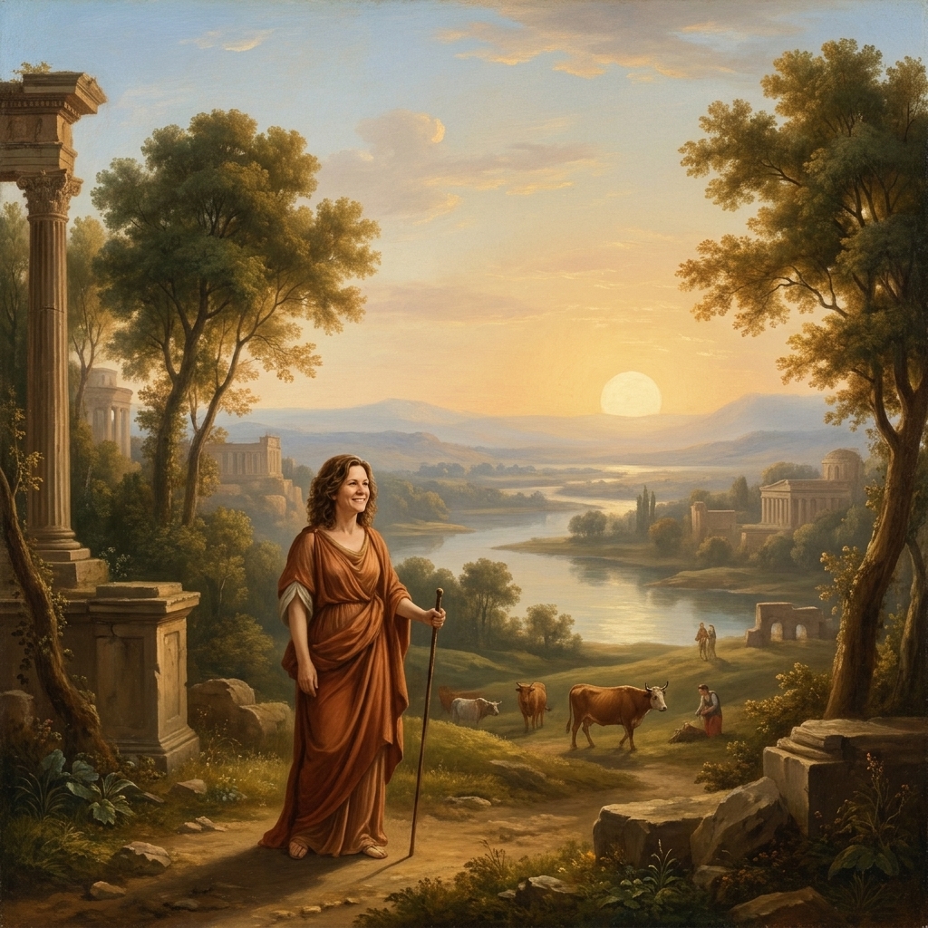
Scale and negative space
Sometimes the simplest compositional move is size. Make something larger and it matters more. Crop a figure so it presses against the frame and suddenly you feel closeness, pressure, urgency.
And then there is negative space, the quiet area around forms. An open sky, an empty wall, a wide stretch of floor. That “nothing” is often doing serious work: isolating the subject, giving the eye a place to rest, or making a small gesture feel louder because it is not competing with clutter.
Rhythm and repetition
I grew up listening to my mother practice cello, and I still think about composition like music. Many classical works use repetition the way a composer uses motifs.
- Repeated shapes like arches, columns, or oval faces create visual rhythm.
- Repeated colors like a ribbon of red moving through a crowd ties sections together.
- Repeated gestures like hands raised at similar angles can unify a narrative moment.
Rhythm helps a complex scene feel coherent. It is the reason a crowded history painting can still read cleanly.
Framing
Some paintings make you feel held. Others feel like they are spilling outward. Both can be intentional.
Internal frames
Doorways, arches, curtains, and clusters of figures can form an internal frame that keeps your attention focused. It is a subtle way of saying: this is the stage, stay with me.
Open compositions
In more dynamic works, artists let forms break toward the edge, suggesting that the world continues beyond the frame. You feel like you have caught a moment mid-action.
Common setups
Think of these less as rigid rules and more as proven staging patterns. Masters used them because they are effective, not because they are mandatory.
The pyramid
Stable, devotional, ideal for Madonna and Child groupings, family portraits, and scenes meant to feel grounded.
The diagonal
Immediate and kinetic. Great for conflict, conversion, collapse, revelation.
The oval
Creates unity and intimacy, especially in group scenes. Your eye loops rather than exits.
Triangle plus counterweight
A central grouping balanced by a secondary element, such as a tree, a curtain, a column, or an opening to landscape. This keeps the composition lively without becoming messy.
Two quick case reads
Caravaggio, Calling of Saint Matthew
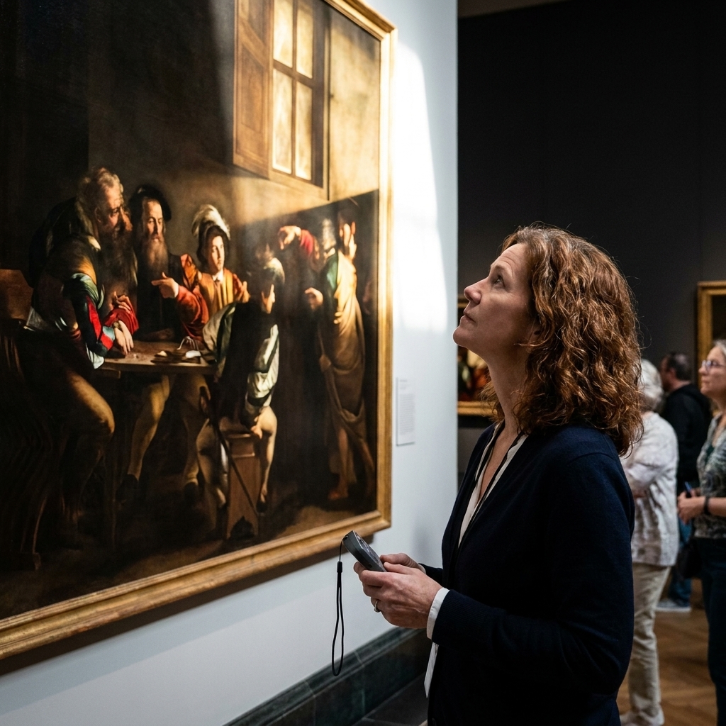
Squint at it and you can feel the value design lock in: a room of darkness with one decisive wedge of light. That light is not only illumination, it is a directional device. It cuts across the scene toward Matthew’s end of the table, then gets echoed by pointing hands and turning heads. Your eye lands where the light lands, then follows the human gestures that confirm the story beat.
Raphael, School of Athens
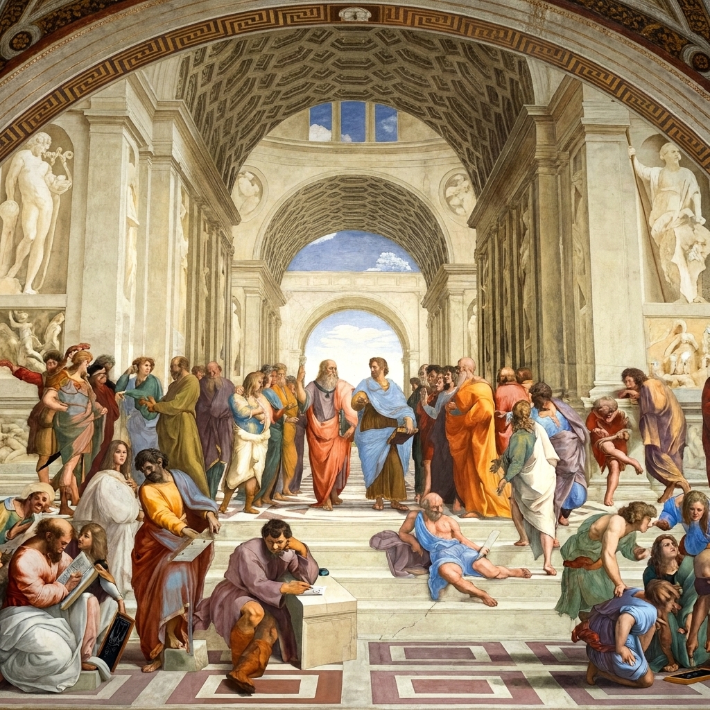
The architecture does the hosting. Perspective lines, steps, and repeating arches pull you inward, then keep you circulating rather than getting stuck. The central pair anchors the scene, but the symmetry is softened by all the small variations in pose and spacing. It is a busy painting that still reads clearly because the structure is doing constant, quiet crowd control.
Practice
You do not need to grid paper or memorize terminology to get better at seeing. Try one of these the next time you are in a museum, or even just scrolling through a museum’s collection online.
- Thumbnail it. Spend 30 seconds sketching the painting as simple shapes: light, dark, medium. No details. Just masses.
- Trace the eye-path. With your finger in the air, trace where your eye travels. Notice what sends you there.
- Identify three anchors. Find the three most “weighty” elements and see how they balance.
- Find one hidden triangle. Connect three key points: faces, hands, bright spots, and see if a triangle appears.
If you are an artist, these are also excellent ways to steal like a professional. Not the subject. The structure.
FAQ
Is the rule of thirds used in classical painting?
Sometimes, yes, but not as a strict formula. Many works place key elements near thirds because it naturally avoids dead-center stiffness. More often, the underlying structure is built from triangles, diagonals, and value masses rather than a modern grid.
What is the most important part of composition?
Clarity. A painting can be calm or chaotic, symmetrical or wild, but if the artist wants you to understand something, composition is what makes that understanding possible.
Why do my eyes keep going to a corner of the painting?
Usually because something in that corner has high contrast, sharp edges, or a strong directional line. Many painters worked hard to prevent accidental focal points. When one sneaks in, it can tug your attention away from the main event.
Can a composition have more than one focal point?
Absolutely. Many narrative paintings use a primary focal point and a few secondary ones, like stepping-stones. The trick is hierarchy: you should feel what matters most, even if several areas are compelling.
A final way to look
Next time you are in front of a classical painting, try this: let your eyes go soft and simply notice where the painting takes you. If it feels like you are being guided by a calm, unseen hand, you are feeling composition doing its oldest job.
High culture is not a locked room. It is a room with good lighting, clear pathways, and a place for you to stand. Composition is one of the reasons.