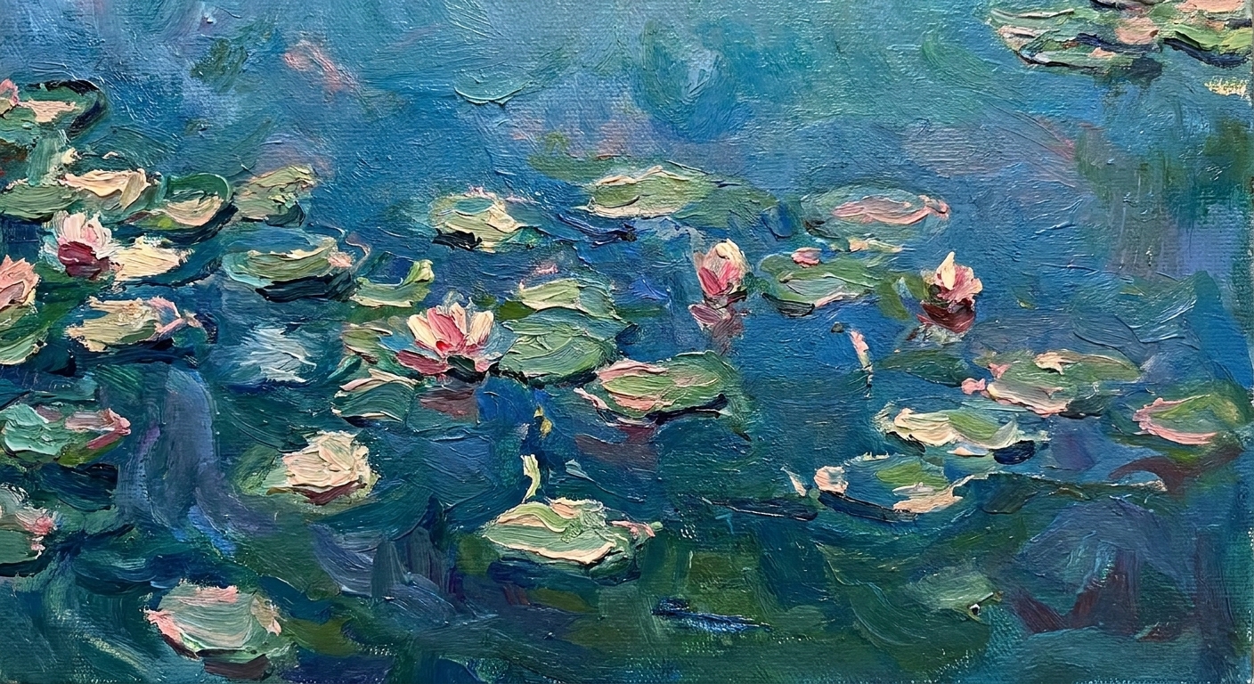
Every time I watch a designer nudge a headline two pixels left, I think about Renaissance painters squinting at a fresco wall, stepping back, stepping forward, chasing balance like it is a living thing. The tools have changed, but the problems feel wonderfully familiar: how do you guide the eye, build depth on a flat surface, and make a viewer feel something before they even know what they are looking at?
The Renaissance was not just a parade of angels and marble anatomy. It was a workshop era, full of practical inventions for picture making. Many of those inventions are baked into modern graphic design, whether you are laying out a poster, building a brand system, or designing a landing page.
1) Chiaroscuro
What it is
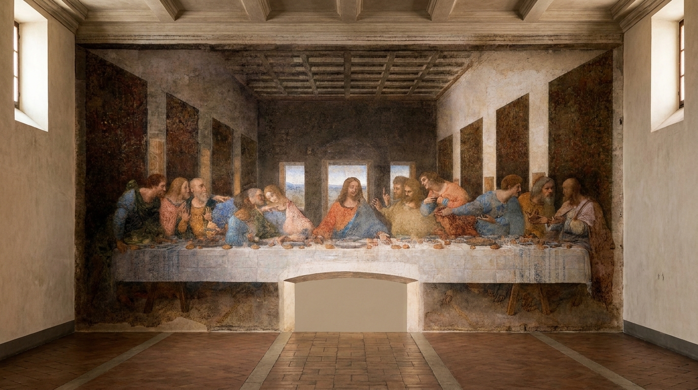
Chiaroscuro is the deliberate play of light and shadow that makes forms feel sculptural. Renaissance artists used it to give faces weight, to separate figures from background, and to make the main action readable at a glance, even in large, busy spaces.
Why designers still use it
Graphic design is physically flat, whether it lives on a screen or a page, but it still needs depth cues. Chiaroscuro is essentially contrast with emotional stakes. It creates hierarchy and mood in one move.
How to use it today
- UI and product mockups: Use controlled shadow, not as decoration, but as structure. A single, consistent light source makes components feel intentional.
- Posters and key art: Push one focal subject into light and let secondary information fall back with softer values.
- Brand photography: Brief photographers for directional light that supports the brand tone: high contrast for intensity, gentle falloff for intimacy.
Designer’s gut-check: If you blur your design or squint, does the focal point still glow like it is on stage?

2) Sfumato
What it is
Sfumato is the soft, smoky transition between tones. Think of edges that dissolve instead of snapping, like breath on a mirror. Leonardo used it to make skin look alive and atmospheres feel real.
Why designers still use it
Not everything in a design deserves a hard edge. Sfumato is a reminder that clarity is not the same thing as harshness. Soft transitions can create sophistication and calm, especially on screens people stare at for hours.
How to use it today
- Gradient work: Use subtle gradients to model depth, not to show off. Aim for “barely there” shifts that support readability.
- Image masks: Feather edges to blend photography into backgrounds without that cutout feeling.
- Background atmospheres: Add a soft tonal haze behind text to improve legibility without boxing it in.
Common misstep: Over-blurring. Sfumato is controlled softness, not fog everywhere.
3) Linear perspective
What it is
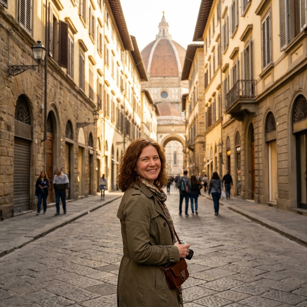
Renaissance artists formalized linear perspective, using vanishing points and converging lines to build believable space on a flat surface. It is math dressed up as poetry. If you want a name to pin it to, Filippo Brunelleschi’s experiments and Leon Battista Alberti’s writing helped turn perspective from a trick into a method.
Why designers still use it
Perspective is a way to choreograph attention. It tells the eye where to go, and it makes a composition feel stable. In an age of endless scrolling, stability helps.
How to use it today
- Poster composition: Use subtle perspective lines in architecture, streets, or interiors to pull viewers toward a title or product.
- 3D and motion: Keep vanishing points consistent across scenes so a campaign feels cohesive.
- Editorial layouts: Even without literal depth, align elements so they “converge” toward a focal column or hero image.
4) Atmospheric perspective
What it is
Also called aerial perspective, this is the trick of making distant objects lighter, bluer, and lower in contrast, because that is what air does to light over distance. Renaissance landscapes used it frequently.
Why designers still use it
Modern design needs layering: foreground, middle ground, background. Atmospheric perspective creates depth without heavy drop shadows or fussy outlines.
How to use it today
- Background systems: Reduce contrast and saturation in background textures so type and UI elements sit forward.
- Data storytelling: Use lighter values for secondary layers, stronger contrast for primary information.
- Illustrative brand worlds: Let distant shapes fade slightly to keep a scene readable.
Quick rule: If it is “farther away” in importance, it should usually be farther away in contrast.
5) The golden ratio
What it is
The golden ratio is a proportional relationship often written as 1:1.618. Renaissance artists and architects were fascinated by harmonious proportion, and the golden ratio is often attributed to that pursuit. Whether or not it was used as systematically as pop culture suggests, it remains a useful compositional lens.
Why designers still use it
Because proportion is felt before it is understood. The golden ratio is not magic, and it is not mandatory, but it can be a helpful starting point when a layout feels “off” and you cannot name why.
How to use it today
- Layout grids: Try a 62/38 split for a hero section: image to copy, or content to sidebar.
- Typography scaling: Use a ratio-based type scale to keep headings, subheads, and body text in a family instead of a crowd.
- Logo spacing: Use proportional relationships to set clear space and element sizing, especially in marks with multiple parts.
Friendly reminder: Renaissance artists also relied on the eye. Use ratios as scaffolding, then refine by feel.
6) Composition and geometry
What it is
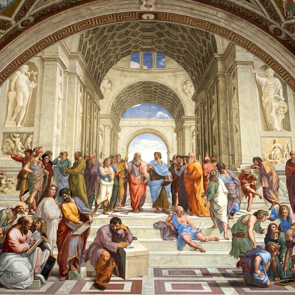
Renaissance compositions often hide a quiet geometric skeleton: triangles for stability, circles for unity, diagonals for movement. The viewer may never notice the structure, but they feel it.
Why designers still use it
This is the backbone of hierarchy. Geometry is how you create a layout that reads like a sentence rather than a pile of words.
How to use it today
- Triangular composition: Place a hero image, headline, and call-to-action at three points of a triangle to create a clear reading path.
- Rule of thirds: Not strictly Renaissance, but aligned with the same thinking. Use it to avoid dead-center stiffness unless you want that ceremonial effect.
- Diagonals for energy: Tilt a band of color, crop a photo at an angle, or align elements along a diagonal to create forward motion.
7) Fresco thinking
What it is
Fresco painting is done on wet plaster, which forces planning. You work in sections, you commit, and you build the image with an awareness of how it will age and be seen in a real space.
Why designers still use it
Replace “plaster wall” with “responsive screen” and you have the same discipline: design as a system, not a single perfect snapshot. Fresco thinking is a mindset of durability and context.
How to use it today
- Design systems: Build reusable components that stay consistent across formats, like a painter repeating a visual vocabulary across a ceiling.
- Working in passes: Block in big shapes and hierarchy first, then refine. Renaissance workshops did not start with eyelashes.
- Environmental awareness: Consider viewing conditions. A poster in a subway station needs bolder value structure than a brochure read at a kitchen table.
Workshop lesson: Make the “underpainting” strong. If it holds in grayscale, it will usually hold in color.
Putting it together
If you want a simple exercise that brings these techniques into your modern workflow, try this the next time you start a design:
- Start with geometry: Sketch a triangle or circle structure to guide your hierarchy.
- Set your value plan: Decide where your brightest lights and deepest shadows live.
- Add depth: Use linear or atmospheric perspective to separate layers.
- Soften intentionally: Use sfumato-like transitions only where you want gentleness or atmosphere.
- Check proportion: If the layout feels wobbly, test a golden-ratio split or a ratio-based type scale.
A quick modern example
Imagine a landing page hero for a new camera. Set a 62/38 split: product photo on the left, copy on the right. Light the camera so it is the brightest object on the page, then let the supporting features sit in softer contrast below. Add a faint atmospheric fade in the background so the headline stays crisp without a box. Finally, align the lens, headline, and “Preorder” button in a gentle triangle, so the eye moves with zero confusion.
Renaissance artists were not aiming for “classic.” They were aiming for effective. That is the part worth stealing. The goal is not to mimic the past, but to borrow its best stagecraft for the images we need now.