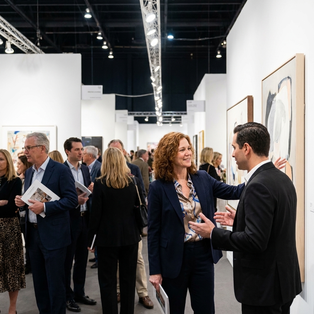
Every few years, I’m reminded that the future of visual design is not born in a boardroom. It is rehearsed in galleries, tested in biennials, and argued over in fluorescent art fair aisles where everyone pretends they are not sweating. If you work in branding, product UI, editorial, motion, or any visual discipline that has to keep its nerve in public, high-culture exhibitions are a kind of weather report. Not a prophecy, but a set of signals. They hint at what materials are coming back, what kinds of images people can tolerate again, and what forms feel newly honest.
Below are ten exhibitions and fairs that reliably shift what designers notice next. Not because we copy them directly, but because they change the room. Meaning: they recalibrate taste, scale, texture, and attention, then those recalibrations drift into the work we all end up making. Think of this as a curated itinerary for your visual brain.
1) Venice Biennale (Venice, Italy)
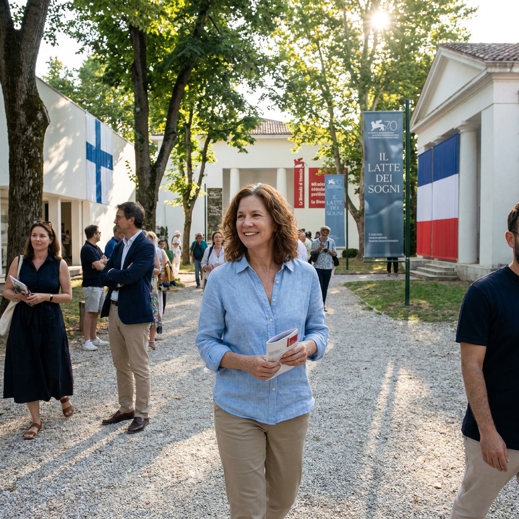
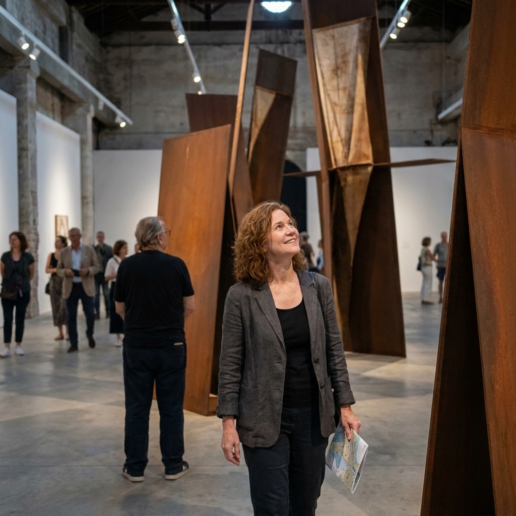
If you want an early read on what “contemporary” might mean to clients a couple years from now, you watch what gets rewarded in Venice. The Biennale’s power is its scale and its permission structure: national pavilions can take conceptual and material risks that would never survive a brand deck, and the main exhibition often exports a vocabulary that later shows up in fashion, retail staging, and design culture.
When: Biennale cadence, typically late spring through fall.
Why designers should care
- Spatial storytelling: exhibition design as narrative, with pacing, silence, and spectacle used like typography.
- Material mood: raw fiber, recycled composites, mirrored surfaces, earth pigments, and high-gloss industrial finishes appearing in tense combinations.
- Image ethics: debates about what reads as exploitative, documentary, or responsible often sharpen here before they surface in mainstream communication.
Concrete artifact: pay attention to pavilion identity systems and wall text hierarchies. The best ones treat labels, maps, and guides as part of the experience, not an afterthought.
Look for: how artists handle scale, especially the move toward environments that feel like walking inside a thought.
2) documenta (Kassel, Germany)
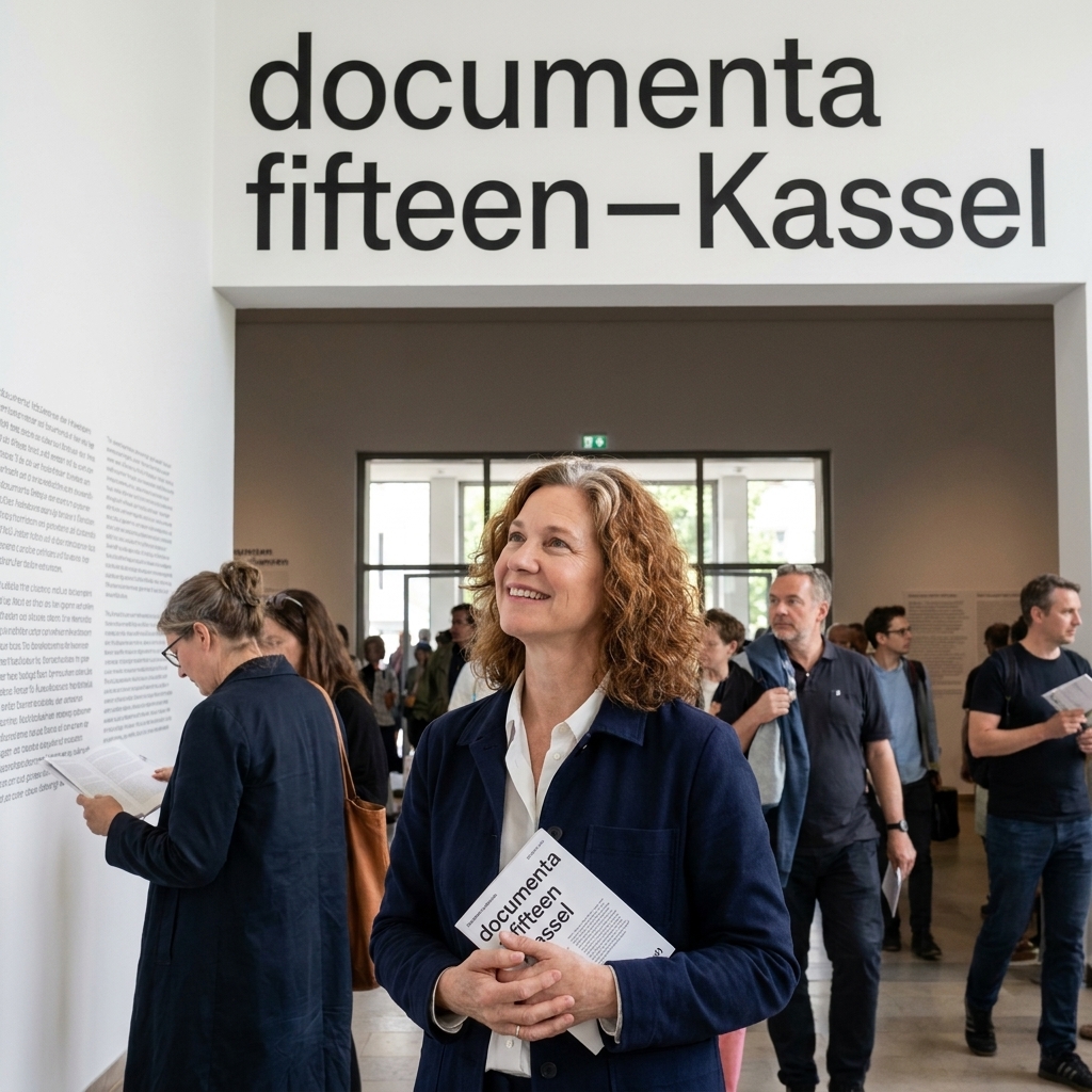
documenta is where the art world often goes to argue with itself in public, and the ripple effect on visual communication can be real. It privileges process, collectivity, publishing, and alternative archives. For designers, it can be a masterclass in systems: how to build coherence across a sprawling, multi-venue project without sanding off complexity.
When: Every five years, with long lead-up and lots of material to study after.
Why designers should care
- Design as infrastructure: wayfinding, readers, posters, and ephemera treated as part of the project, not decoration.
- Anti-polish aesthetics: photocopy textures, zines, community noticeboard energy, and deliberately unresolved layouts.
- New forms of authorship: collective identities and decentralized credits influencing how studios present themselves.
Concrete artifact: track the publication ecosystem: readers, newsprint handouts, poster series, and online archives. It is a blueprint for content density without corporate gloss.
3) Art Basel (Basel, Switzerland)
Art Basel is not shy about being a marketplace, and that is exactly why it matters for designers. It is a concentrated view of what is being validated, what is being packaged, and how taste becomes a product without saying the quiet part out loud. The booths are like micro-websites: each one a brand system with rules, voice, and intent.
When: Annual, usually early summer.
Why designers should care
- Premium minimalism pressure: the eternal return of clean grids, high-contrast walls, and spare typography, often updated with warmer materials.
- Display mechanics: how lighting, spacing, and negative space create perceived value.
- Color forecasting, quietly: not trend reports, but what collectors seem willing to live with.
Concrete artifact: collect gallery printed matter: checklists, invitations, catalogs, even the typography on price lists. The best galleries treat takeaways as tiny, immaculate brand worlds.
Look for: booth graphics and paper stock choices. They tell you what “expensive” is currently allowed to look like.
4) Art Basel in Hong Kong (Hong Kong)
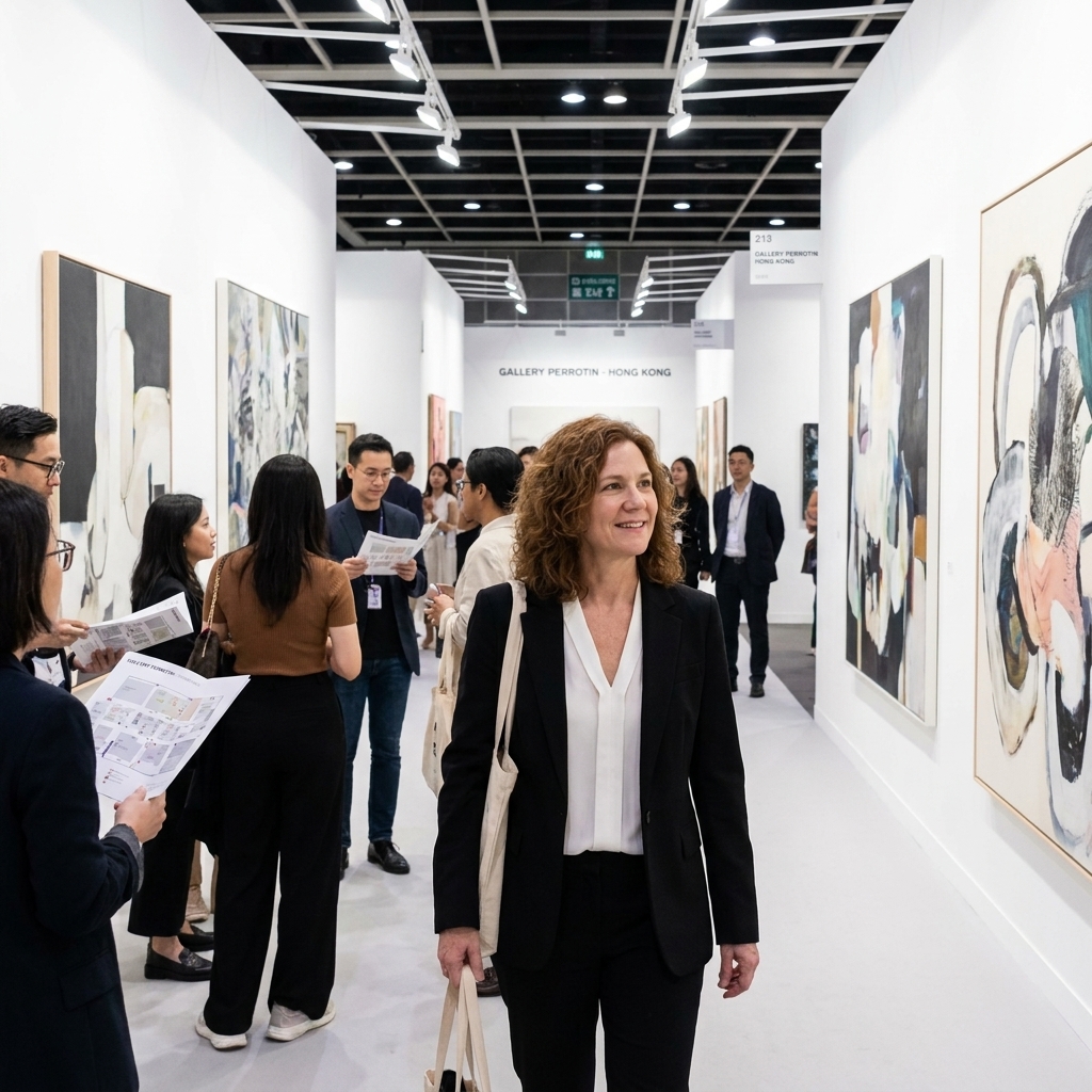
Where Basel can feel like a cathedral, Hong Kong is a switchboard. Aesthetic languages cross here fast: ink traditions and digital gloss, artisanal craft and hyper-commercial pop, austerity and maximal saturation. If you design for global audiences, this fair is a reality check on what “universal” actually looks like in the wild.
When: Annual, typically in spring.
Why designers should care
- Surface intelligence: lacquer, resin, neon, screen-based work, and material illusionism.
- Hybrid iconography: motifs traveling between cultures and platforms without landing as pastiche.
- Photography’s next life: what feels fresh after years of image overload.
Concrete artifact: note how galleries handle bilingual typography and signage density. The best solutions are quiet lessons in hierarchy and rhythm.
5) Frieze London (London, UK)
Frieze London has a particular sensitivity to the theatrical. It understands that contemporary art does not just hang, it performs. For designers, this is fertile ground for thinking about how messages move through bodies in space, and how graphic identity can feel alive rather than stamped on.
When: Annual, typically in the fall.
Why designers should care
- Editorial intelligence: Frieze’s surrounding talks, projects, and commissions model how to build a content ecosystem without becoming content sludge.
- Playful rigor: wit paired with tight design decisions.
- Typography in the wild: how type behaves when it has to coexist with spectacle.
Concrete artifact: study the fair’s printed guide and wayfinding. Temporary architecture plus high traffic forces design decisions that are brutally honest about legibility.
Look for: the tension between polished commercial presentation and moments of deliberate mess.
6) The Whitney Biennial (New York City, US)
The Whitney Biennial is one of the clearer mirrors of American visual anxiety and American visual invention. You see where image-making is tender, where it is defensive, and where it is radically unserious on purpose. Designers often leave with a refreshed sense of what “contemporary” can sound like when it stops trying to be neutral.
When: Biennial cadence, timing varies.
Why designers should care
- Text as material: language used as sculpture, projection, score, or complaint.
- New realism: bodies, labor, domesticity, and documentation treated with formal sophistication.
- Digital spillover: meme logic and screen rhythms entering physical space.
Concrete artifact: watch how captions and didactics handle context without flattening work into slogans. It is a live case study in tone of voice under pressure.
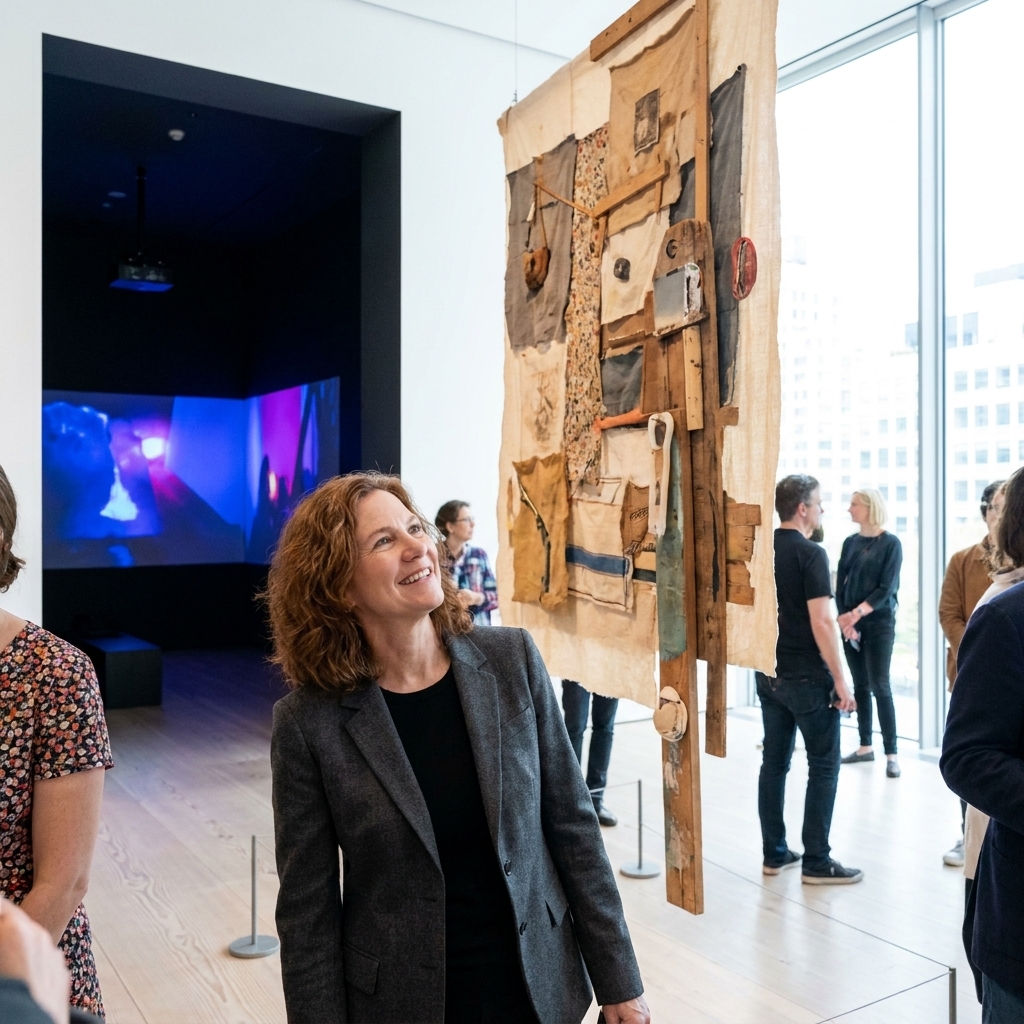
7) MoMA design shows (New York City, US)
MoMA’s design, architecture, and media exhibitions have a specific kind of authority. They do not just reflect taste, they can formalize it. When MoMA frames an object, a type system, a movement, or a technology, it gives designers permission to treat those choices as part of a lineage rather than a passing moment.
When: Rotating programs year-round.
Why designers should care
- Canon formation: what gets called design history while it is still in motion.
- Interface literacy: exhibitions that take screens seriously as cultural objects.
- Proportion and restraint: a reminder that clarity is a craft, not a default setting.
Concrete artifact: the exhibition graphics and catalogs. Even when you disagree with the framing, the typographic decisions are often impeccably argued.
Look for: how interpretive design makes complex work feel navigable without making it cute.
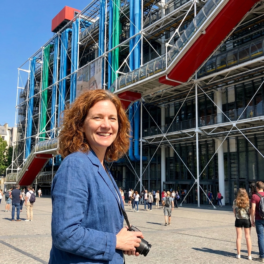
8) Centre Pompidou surveys (Paris, France)
The Pompidou has a gift for making modernism feel less like a religion and more like a set of tools you can still pick up. Its major surveys are a designer’s pantry: color strategies, typographic histories, poster traditions, radical publishing experiments, and the long shadow of the grid, constantly being challenged by bodies and politics.
When: Rotating major surveys throughout the year.
Why designers should care
- Modernism’s afterlives: what still feels useful, and what now reads as sterile.
- Poster DNA: how exhibition graphics echo into editorial and identity work.
- Cross-discipline permission: performance, film, photography, and painting treated as one conversation.
Concrete artifact: photograph the entrance typography and the poster campaigns around the city. Pompidou shows often leak into public graphic culture in a way designers can actually measure.
9) Milan Design Week (Milan, Italy)
If you want a direct line between culture and commerce, Milan Design Week is the loudest classroom. It is where product, interior, fashion, lighting, and brand theater collide at full volume. For visual designers, it is less about chairs and more about staging: how objects, graphics, and narrative get braided into a single environment people want to photograph.
When: Annual, typically in spring.
Why designers should care
- Brand worlds at 1:1 scale: installations that operate like physical landing pages.
- Material literacy: finishes and fabrication trends you will soon see translated into UI texture, motion behavior, and packaging cues.
- Photography-aware design: experiences built for the camera, then optimized for memory and sharing.
Concrete artifact: collect signage, invites, and spatial graphics from showrooms and pop-ups. The best ones solve a hard problem: how to feel premium while handling crowds, queues, and chaos.
Look for: how lighting and typography collaborate. Milan is where you learn that type is also an atmosphere.
10) Ars Electronica (Linz, Austria)
Ars Electronica is a reliable signal for where visual culture meets computation without pretending the interface is neutral. The festival sits at the intersection of art, research, performance, and technology, which makes it useful for designers who build for screens and systems, not just surfaces. It does not predict the future, but it tends to prototype it in public.
When: Annual, typically in early fall.
Why designers should care
- New interaction languages: gestures, sensors, and responsive environments that push beyond tap and scroll.
- Soft-tech aesthetics: low-glare projection, ambient sound, calm interfaces, tactile materials.
- Legibility under complexity: how to communicate dense ideas without making the experience feel like a manual.
Concrete artifact: study demo interfaces and the explanatory design around them. Labels, diagrams, and onboarding screens here are often the difference between wonder and confusion.
Look for: how time is designed, not just visuals. A lot of the best work is about pacing, waiting, and feedback loops.
How to study these shows
You do not have to take a plane to get value from this list. Most of these events publish catalogs, walkthrough videos, installation shots, and curatorial texts that are gold for visual thinking. What matters is how you look, and what you do with what you notice.
- Track three things: color, type, and texture. Note what feels newly calm, newly loud, newly tender.
- Screenshot the seams: wall labels, maps, tickets, tote bags, websites, and social templates. The peripheral design often reaches the mainstream first.
- Notice the pace: where you slow down, where you skim. That is information architecture in physical form.
- Keep a material diary: what finishes repeat across venues: matte vinyl, raw linen, plexi, brushed metal, risograph grain.
Turn it into usable output
- Build a swipe file with taxonomy: create folders for “type hierarchy,” “caption tone,” “wayfinding,” “surface,” and “lighting.” Save fewer images, label them better.
- Do a monthly 30-minute review: pick one event, skim a walkthrough, then write down three decisions you would steal, and one you would avoid.
- Translate into a studio prompt: “Make it legible from 10 feet,” “Design the label like it is the hero,” “Solve bilingual hierarchy,” “Make it feel expensive without using black.”
And if you only remember one thing: the future of visual design is rarely a single style. It is a negotiation between clarity and complexity, between comfort and friction. These exhibitions are where that negotiation becomes visible.