Walk into a great exhibition and you can feel the design before you consciously notice it. Your pace changes. Your shoulders drop. Your eyes start doing that searching thing they do when a space is guiding you without barking orders.
Over the last few years, gallery design has shifted from “neutral container” to something closer to dramaturgy: a sequence of cues, pauses, reveals, and shifting moods. Some of these choices are loud and theatrical. Others are so gentle you only register them later, the way you realize a friend has been holding the door for you the whole time.
Below are eight exhibition design trends currently transforming modern galleries, plus a few practical ways to spot them. Where it helps, I have named real institutions and recent touchstones so “trend” does not float away into vibes.
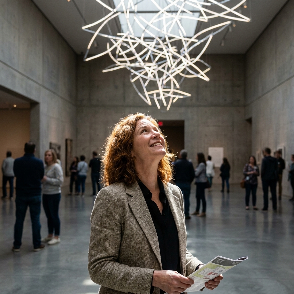
1) Immersive rooms as a medium
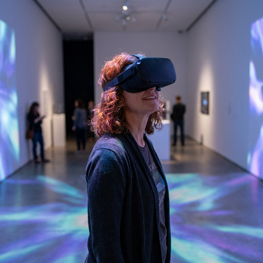
Immersion is no longer a novelty reserved for the occasional blockbuster. More exhibitions are designing the whole room as a material: walls, floor, sound, smell, and sometimes even climate cues (think warmth, humidity, or airflow used as part of an installation) become part of the encounter.
At its best, immersive design does not swallow the artwork. It supports a specific way of seeing. A projection might extend a painter’s palette into ambient light. A sculptural installation might choreograph how you circle it, like a slow dance where you keep discovering new angles.
If you want a headline example of this shift at scale, look at how Tate Modern’s Turbine Hall commissions turn architecture into content. For a more explicitly immersive, room-as-canvas approach, teamLab’s large environments make the visitor’s movement part of the work.
What it looks like
- Black-box rooms for video and time-based work that feel intentional, not “temporary.”
- Light and sound that shift as you move, emphasizing duration and attention.
- Thresholds, reveals, and quiet corners that pace your attention.
Curator’s note: Immersion works when it has a thesis. If the design can be swapped onto any show, it is set dressing, not interpretation.
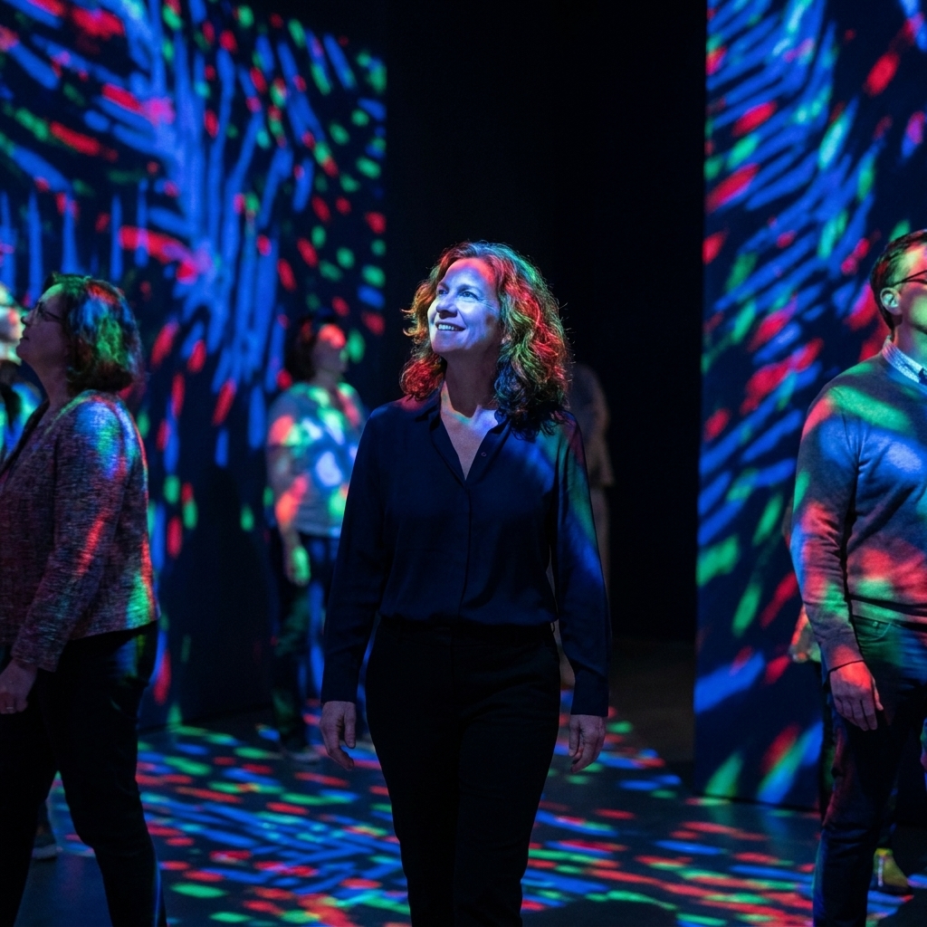
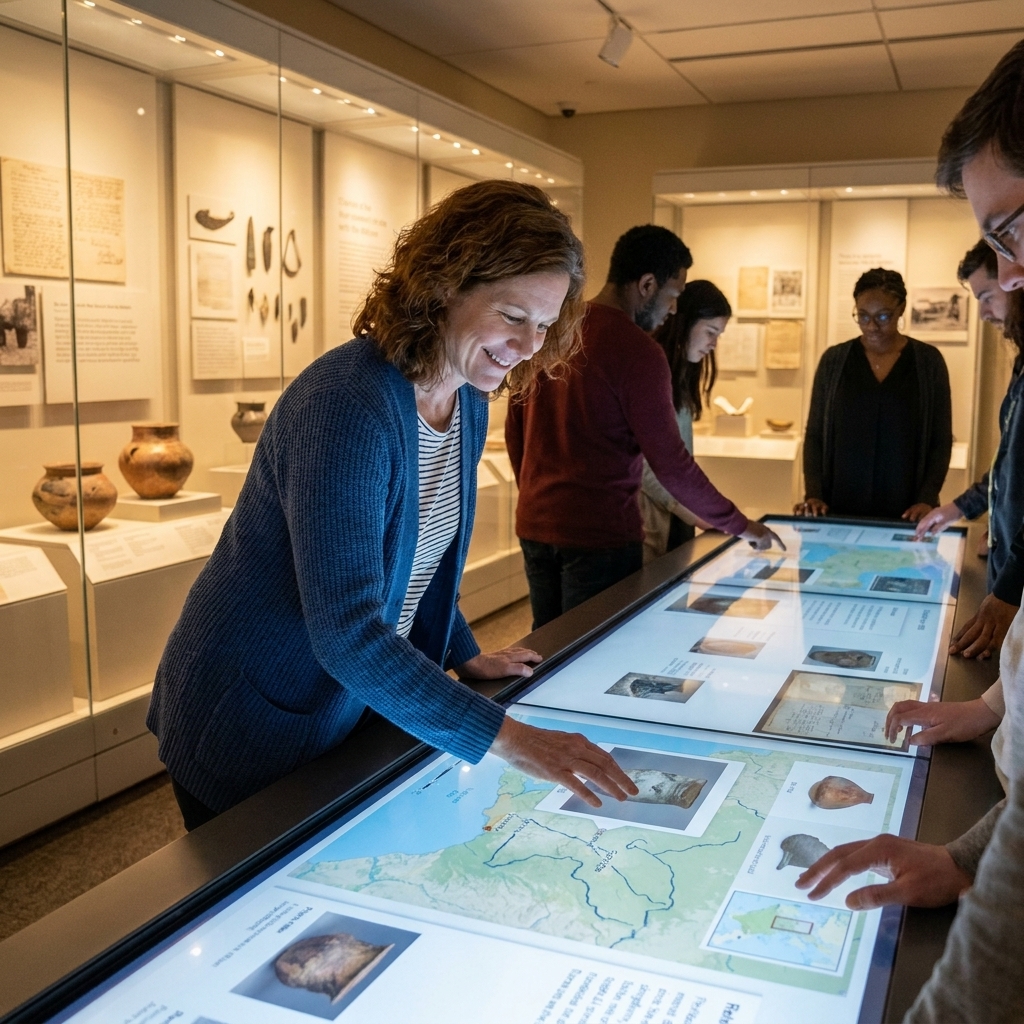
2) Interactivity with an off-ramp
Interactive design is maturing. The early “press the button” era is giving way to subtler invitations: touch, choice, participation, and feedback that feel like an extension of the art rather than a distraction from it.
It also expands access. Interactivity can create multiple entry points for visitors who are new to galleries, for people with different sensory needs, and for anyone who learns best by doing. Cooper Hewitt’s hands-on digital tables are a widely cited example of tech that supports looking rather than replacing it.
Design moves you will notice
- Hands-on replicas or material libraries placed near fragile originals.
- AR layers that can reveal underdrawings, restorations, or process without demanding your attention every second.
- Listening stations that feel intimate, with seating that does not scream “tech corner.”
Watch for: Good interactive design always includes an off-ramp. You should be able to say “not today” and still have a complete experience.
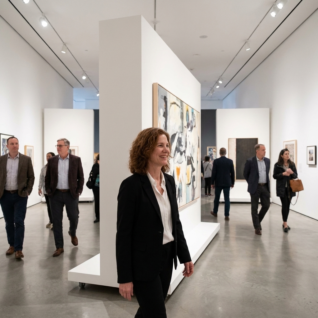
3) Modular walls and flexible rigs
Permanent white walls are becoming less permanent. Many institutions are building exhibitions with systems: movable partitions, adaptable plinths, flexible hanging grids, and ceiling tracks or rigging that can shift lighting, curtains, and screens quickly. It is not just a budget-friendly choice. It is a philosophical one.
Modularity lets curators respond to specific artworks and artists instead of forcing every show into the same spatial grammar. It also supports faster changeovers and more experimental programming, including installations that evolve mid-run.
Why it changes viewing
- More varied sightlines, including diagonal views and layered rooms.
- Better scale-matching, so small works are not swallowed by cavernous spaces.
- Space that can adapt to performance, talks, and social practice without feeling improvised.
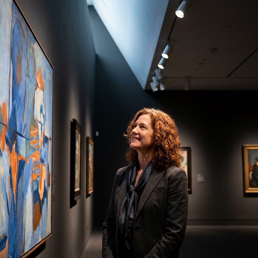
4) Lighting with a point of view
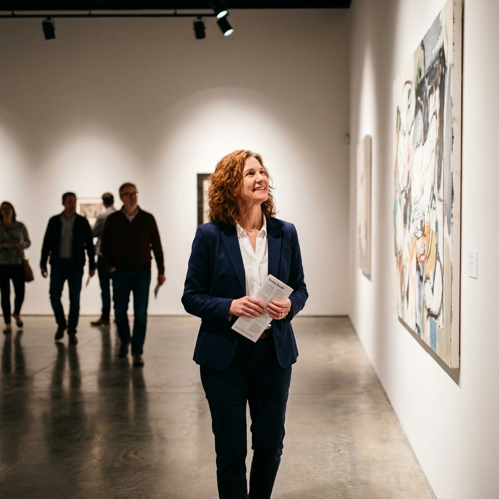
Lighting has always mattered, but recent exhibition design treats it as narrative. Instead of evenly washing everything with the same neutral glow, galleries are using light to shape rhythm and mood: bright clarity for close looking, softer pools for contemplation, and intentional darkness for time-based work.
Better LEDs and smarter controls make it possible to tune color temperature and intensity with remarkable precision. That helps protect delicate works while keeping the galleries from feeling clinical.
Trends inside the trend
- Warmer color temperatures that make spaces feel less sterile.
- Sharper spotlighting for sculpture and texture-forward painting.
- Layered lighting that guides you, so signage does not do all the work.
Small but meaningful: You can often tell when lighting has been designed with care by how long you linger without noticing you are lingering.
5) Seating that signals permission
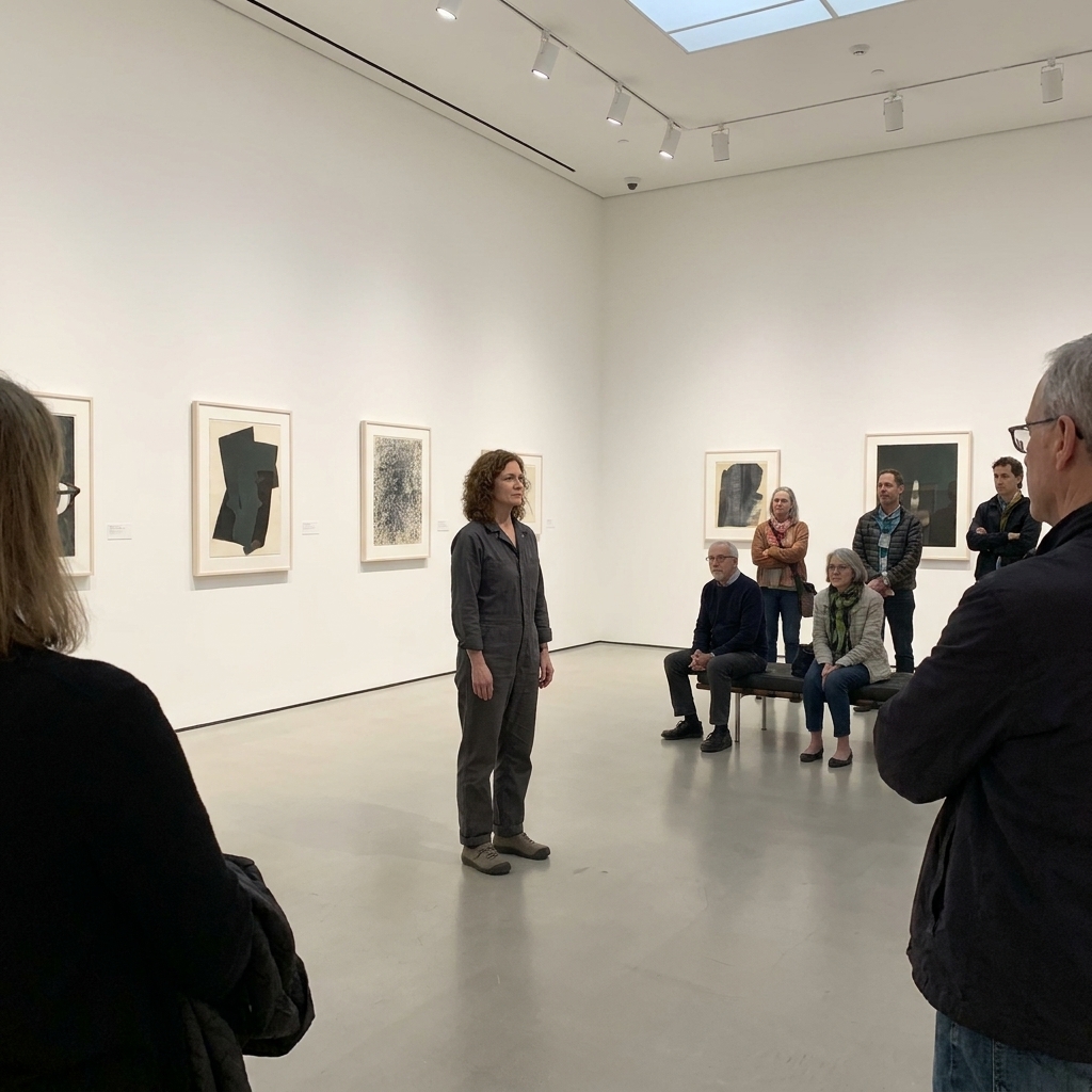
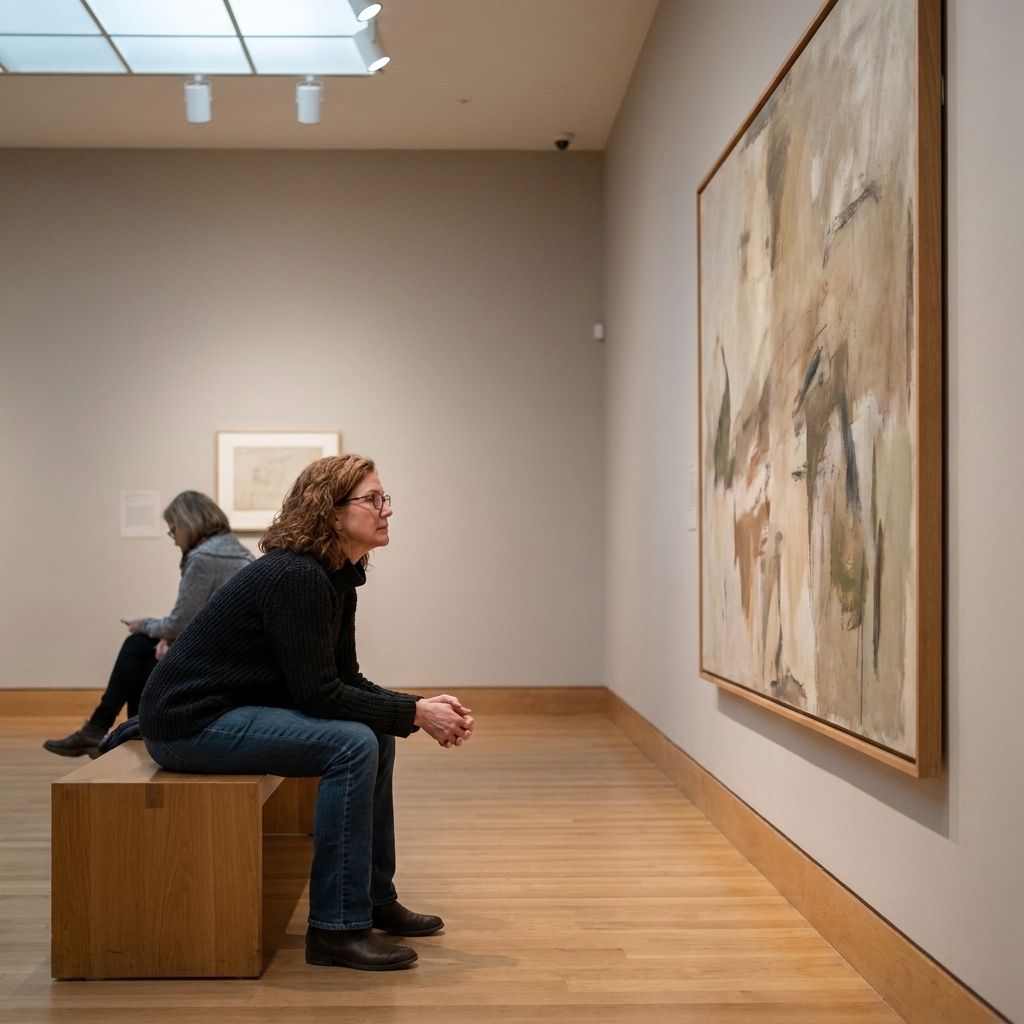
One of my favorite quiet revolutions is simply this: more places to sit. Not the grudging bench in the middle of the room, but seating that feels like a real invitation to spend time.
This is exhibition design acknowledging a basic truth. Looking is physical. Standing for hours is not a moral achievement. When visitors can rest, they read more, listen more, and return to a work for a second pass, which is where the good stuff often happens.
What good rest design includes
- Benches placed with intentional views, like a front-row seat.
- Chairs near audio works that let you listen without hovering.
- Low-stim corners for sensory breaks, especially in busy exhibitions.
- Seating variety for different bodies, including options with backs and arms when possible.
6) Sustainable builds that look intentional
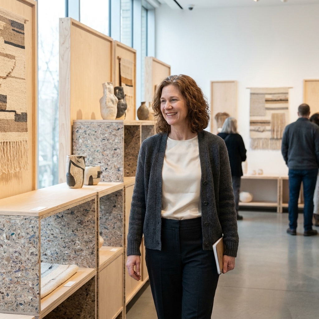
More galleries are treating sustainability as a design constraint and a creative catalyst. That means fewer one-off builds destined for dumpsters and more reusable walls, recycled materials, low-VOC paints, and locally sourced fabrication.
The best part is that “sustainable” no longer has to read as rough or makeshift. Many designers are leaning into honest textures: plywood edges, visible fasteners, cloth curtains, and modular systems that look deliberately made rather than temporary.
Signs a build was designed to be reused
- Standardized wall dimensions designed for reuse across shows.
- Circular material choices, documented take-down plans, and storage that makes reuse realistic.
- Graphics printed on recyclable substrates, or designed so titles can be swapped without replacing whole panels.
7) Labels as hospitality
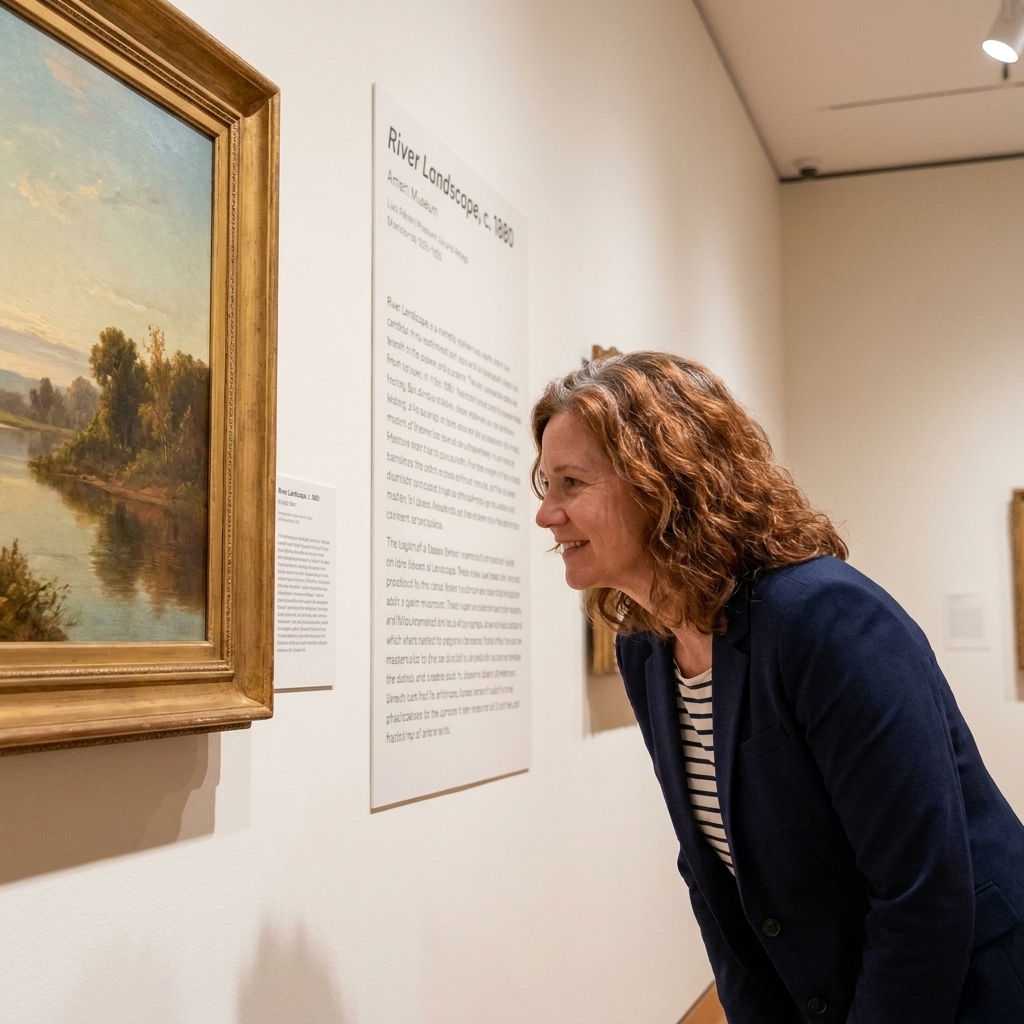
Wall text is having a glow-up. Not because it is getting louder, but because it is being integrated thoughtfully: legible typography, considerate placement, and multiple layers of interpretation so you can choose your depth.
In other words, the label is no longer a scolding paragraph at eye level. It is part of the exhibition’s welcome. Increasingly, that welcome is multilingual, designed with better contrast, and paired with audio or captions so more visitors can actually use it.
What is changing
- Short entry labels that orient you without overwhelming you.
- Deeper optional texts via QR codes, mobile guides, booklets, or tucked-away reading nooks.
- Plainspoken language that trades jargon for clarity.
My litmus test: If a teenager can read the first sentence and feel curious instead of excluded, the interpretation is doing its job.
8) Galleries built for live use
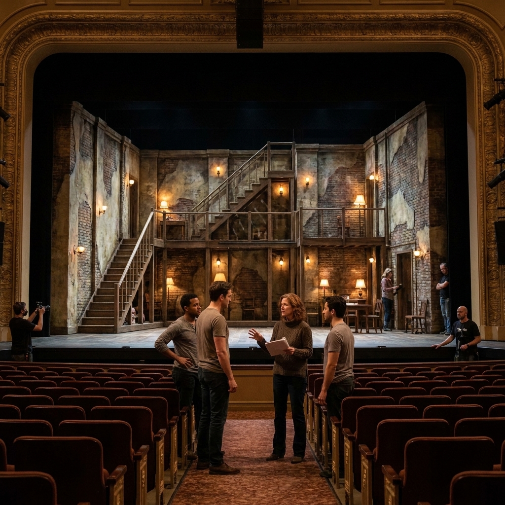
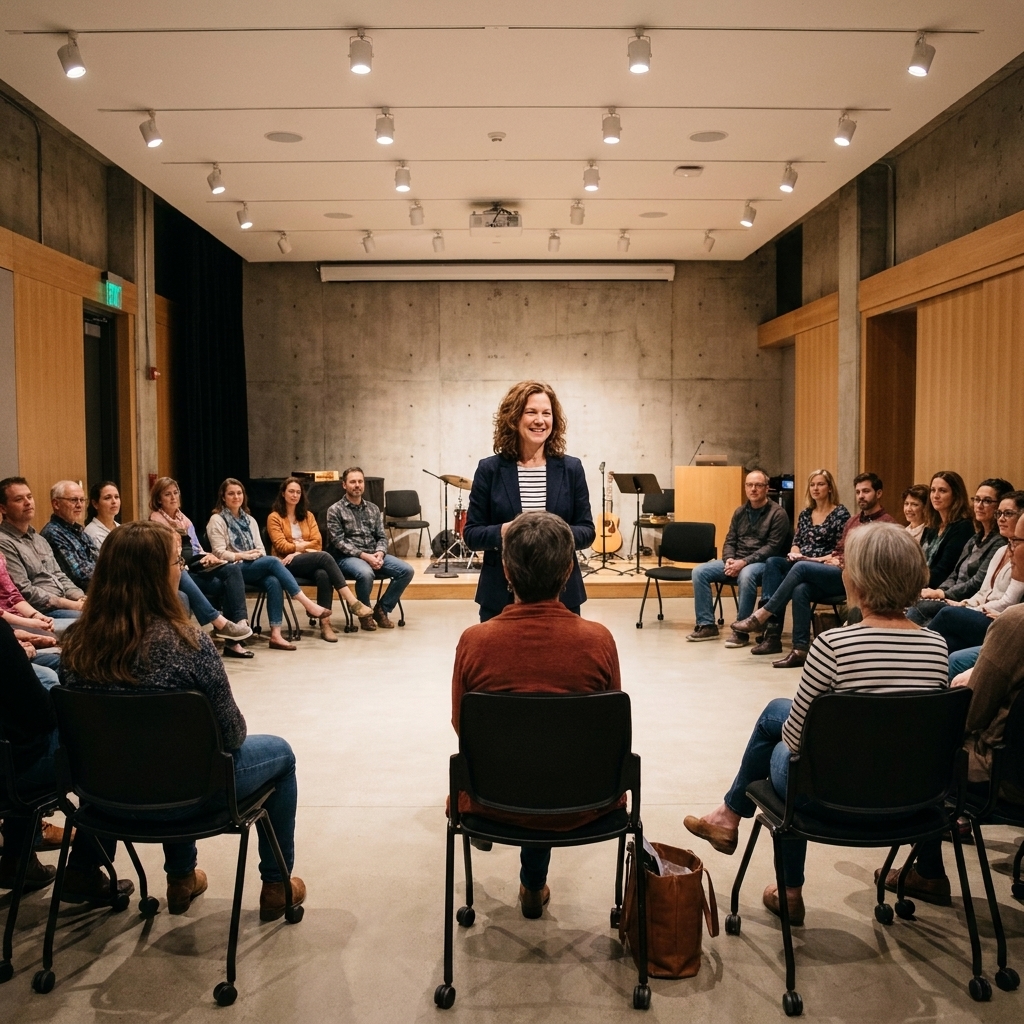
Galleries are increasingly designing exhibitions with performance in mind. Not as an add-on, but as a built-in possibility. You will see open zones that can host a reading, a movement work, a community workshop, or an artist talk without dismantling the show. The Shed in New York is a clear example of a venue where spatial flexibility is part of the mission.
What makes this trend feel serious (not just “events programming”) is the way it changes object display too. Sightlines are kept clear, fragile works are buffered from crowd flow, and the room can absorb a gathering without turning the art into background scenery.
Design features that help
- Flexible open areas with durable floors and discreet AV infrastructure.
- Movable seating stored nearby, not “somewhere else in the building.”
- Acoustic planning so a conversation can happen without flattening the rest of the show.
- Traffic patterns that protect artworks when the room gets busy.
How to spot design decisions
If you want a simple way to understand exhibition design, try this on your next museum day: notice how the space is asking you to behave. To slow down. To gather. To be quiet. To touch. To listen. To look up. To look again.
Two practical tells, especially in high-traffic shows: wayfinding and flow. Look for subtle cues (floor lines, lighting shifts, sightline “pulls,” doorway framing) that keep you oriented without turning the gallery into an airport. Post-pandemic, many institutions have become more intentional about where crowds compress and where they can exhale.
Great design does not dictate. It proposes. And the most exciting galleries right now are proposing experiences that feel more human: less intimidating, more sensory, and more aware that art is not only something we see. It is something we spend time with.
When exhibition design is working, you leave remembering the art, but you also remember how it felt to be in your body while you met it.
Quick FAQ
Are immersive exhibitions replacing traditional shows?
No, and I hope they never do. Immersive design is one tool among many. The healthiest institutions program a range: quiet, object-centered shows alongside more environmental, time-based experiences.
Why are galleries darker now?
Partly because video and projection-based work is more common, and partly because controlled light can protect sensitive objects (works on paper, textiles) while focusing your attention. The best dark galleries still give you clear pathways, readable text, and places to rest your eyes.
Do interactive elements make exhibitions feel less serious?
They can, if they are gimmicky. But thoughtful interactivity can deepen seriousness by offering process, context, and access without requiring a prior art-history vocabulary.
Why does lighting matter so much?
Because it shapes what you can see, how long you can look, and what details your eye decides are important. Lighting is not decoration. It is interpretation.