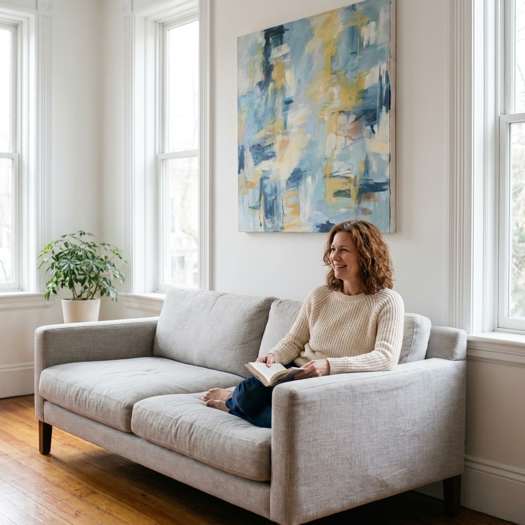
Good art lighting feels a little like good theater lighting. You do not notice the equipment, you notice the moment. The brushwork suddenly has depth. A bronze stops looking flat and starts breathing. And you do not have to turn your living room into a museum to get there. You just need a few smart choices about color, control, and placement.
This guide walks you through lighting canvas paintings and sculptures at home using professional principles that protect the work. No scorched varnish, no spotlight glare, no “why does my white wall look green” surprises.
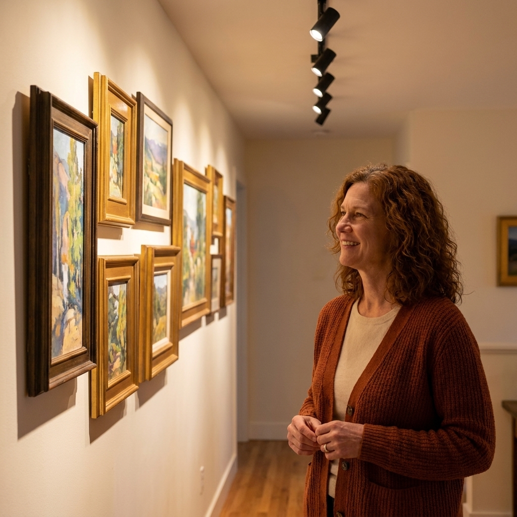
Start with safety
Light is wonderful, and also quietly bossy. Over time it can fade pigments, yellow paper, and accelerate aging in textiles and photographs. Heat is the other culprit. The good news is that modern LED fixtures make “beautiful” and “safe” much easier to achieve in a home.
Choose LEDs, nearly every time
- Lower heat at the artwork: LEDs typically send far less heat forward than halogen or incandescent bulbs.
- Negligible UV compared to older lamps: Quality white LEDs generally have very little UV output compared with halogen and many other legacy sources. For valuable or sensitive work, choose reputable, display-rated LEDs with published specs.
- Control: Dimming and beam shaping are much better with modern fixtures.
Avoid halogen spots for close-range art lighting. They can be gorgeous, but they run hot, and their heat and UV/IR output make long-term damage easier to invite when aimed tightly at a work.
Brightness matters
Museums often talk in lux, which is just “how much light is hitting the surface.” You do not need a meter to do a good job, but the targets help. Think of these as typical guidance, not rigid law:
- Oil and acrylic paintings, most sculpture: roughly 150 to 300 lux is a common display range.
- Works on paper, photographs, textiles: keep it lower, often 50 lux or less.
- Very light-sensitive media: some watercolors, pastels, dyed prints, and certain contemporary materials may need below 50 lux, plus shorter “on” time.
If you love a bright, lively room, let the ambient lighting do the heavy lifting. Keep the art accent lighting controlled and focused, especially for paper.
Control daylight
Sunlight is the most dramatic light source in your home, and also the least negotiable. If the piece is valuable or sensitive, treat direct sun as a red flag.
- Use UV-filtering window film or UV-filtering shades for rooms with art.
- Hang sensitive works on walls that do not receive direct sun.
- Rotate works on paper seasonally if you love displaying them.
Think in lux-hours
Preservation is not just about how bright the light is today. It is also about cumulative exposure over weeks and years. If you want a simple upgrade that actually protects the work, use dimmers, timers, or a smart switch, and turn accent lights off when you are not enjoying the piece.
Color temperature
Color temperature is measured in Kelvin, and it is basically the emotional climate of your lighting. Too warm and whites turn buttery. Too cool and skin tones in portraits can look a bit haunted.
Go-to ranges for home display
- 2700K: Cozy, candle-adjacent warmth. Lovely for traditional interiors and older varnished oils, but can make modern whites look creamier than intended.
- 3000K: The sweet spot for many homes. Warm but not sleepy. Often my first recommendation for mixed collections.
- 3500K: Clean and contemporary, still friendly. Great for modern painting, black-and-white photography, and crisp white walls.
- 4000K: Daylight-leaning. Can look clinical in a living room, but works in studios, minimalist spaces, or if you want very neutral presentation.
If you have a mix of art across rooms, you can vary temperature by space. What you want to avoid is a single wall where one painting is lit at 2700K and its neighbor at 4000K. They will argue all day.
CRI
CRI (Color Rendering Index) tells you how faithfully a light source reveals color. For art, aim high:
- CRI 90+ is a solid baseline for home galleries.
- CRI 95+ is ideal if you are lighting paintings with nuanced skin tones, saturated reds, or subtle neutrals.
If a product only says “bright white” without listing CRI, I treat that as a warning sign. Art deserves receipts.
Fixtures that work
Think in layers: ambient light so the room feels comfortable, and accent light that brings the artwork forward. The goal is not to blast the piece, it is to sculpt it.
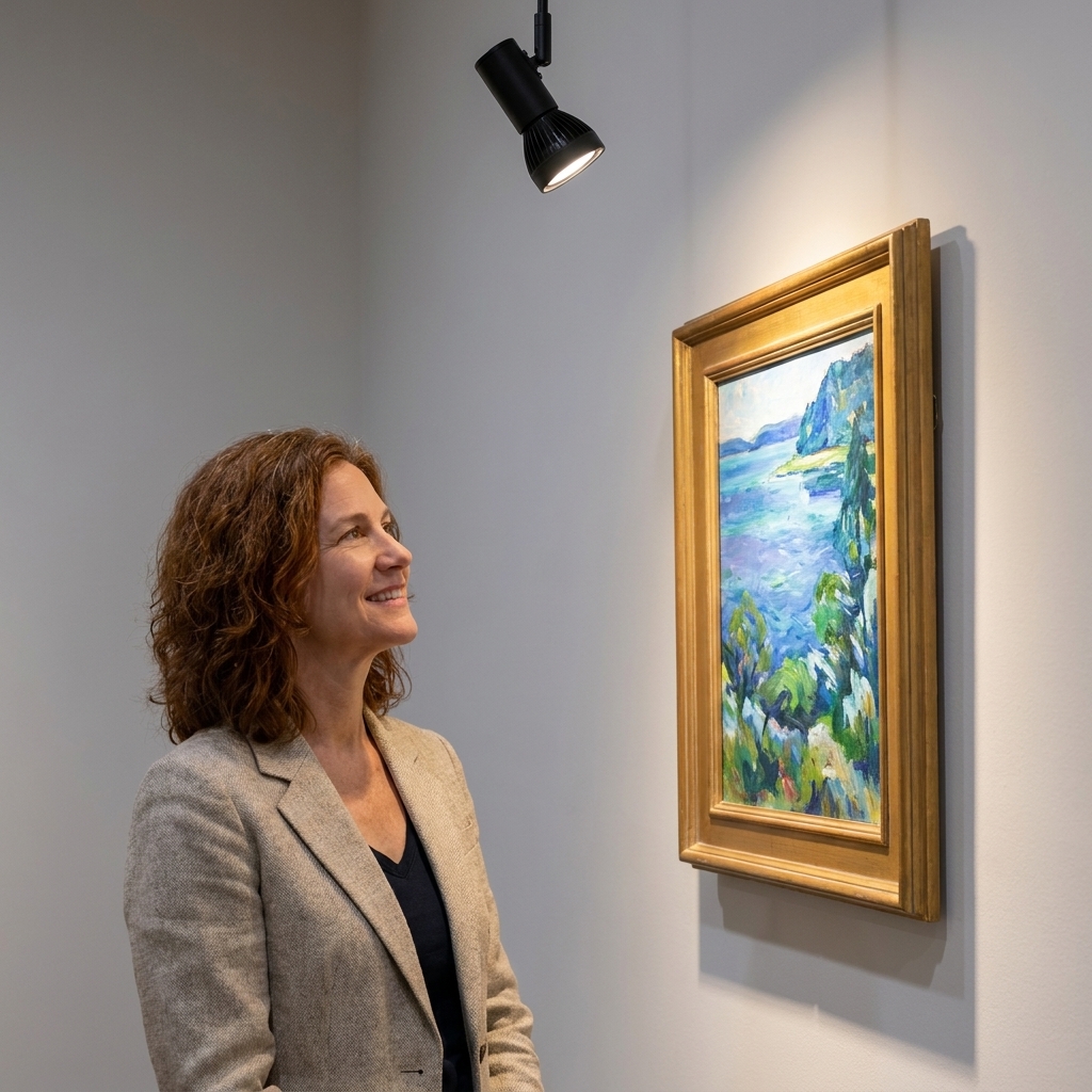
Track lighting
If you have multiple pieces on one wall, track lighting is the most adaptable solution. You can add heads, change beams, and re-aim as your collection shifts.
- Choose track heads with interchangeable lenses or adjustable beam angles.
- Look for deep-set LEDs or added glare control accessories (snoots, honeycomb louvers).
- Use a dimmer that is compatible with LEDs.
A practical placement starting point: for an 8 to 9 foot ceiling, track often lands well about 2 to 3 feet (60 to 90 cm) out from the wall. That makes the 30-degree aim easier and usually reduces glare.
Picture lights
A picture light mounted above a frame can look beautifully intentional. It is less ideal for larger pieces because it can create a bright band at the top and falloff below.
- Use LED picture lights with good CRI and a diffuser.
- Keep the light projecting down and out, not straight down.
- Test glare carefully if the work is glazed.
Recessed downlights
Recessed ceiling lights can be clean and modern, but they often create steep top-down light that flattens paintings and throws unhelpful shadows on sculpture.
- Use them for ambient fill.
- If you want recessed for art, choose gimbal or wall-wash styles designed to aim and spread.
Wall washers
Wall washing creates an even sheet of light down the wall. It is excellent for clusters of work, textured surfaces, and spaces where you want soft, flattering consistency.
- Place washers at an appropriate distance from the wall so the light blends evenly.
- Keep brightness modest to avoid overpowering the art.
For sculpture
Sculpture comes alive with shadows. Overhead downlight alone can make a figure look like it is standing under interrogation.
- Use an adjustable spotlight from a 30 to 45 degree angle.
- Add a gentle fill from the opposite side if shadows get too harsh.
- For glass or glossy ceramics, prioritize glare control and softer beams.
Angles and placement
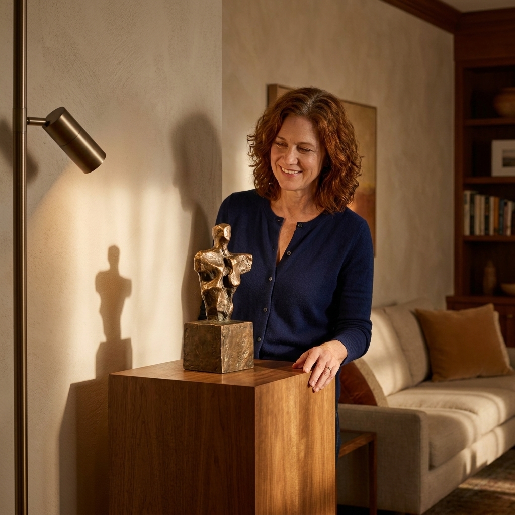
If I could hand every home collector just one rule, it would be this: start at 30 degrees. It is the workhorse angle for lighting art without glare.
The 30-degree rule
Position the light so it hits the artwork at about 30 degrees from vertical (imagine a line straight down the wall, then tilt the light outward).
- Why it works: it reduces hotspots and minimizes reflected glare into your eyes, especially on framed pieces behind glass.
- How to set it: stand where you normally view the work, then adjust until you cannot see the lamp reflected in the glass.
Beam spread
Beam angle is the width of the light. Too narrow and you get a bright center with dim corners. Too wide and you light the wall, not the artwork.
- Narrow (10 to 20 degrees): small works, objects, dramatic sculpture accents.
- Medium (25 to 40 degrees): most medium-sized paintings.
- Wide (45+ degrees): large canvases, wall washing, groupings.
A quick field trick: if the artwork looks like it has a “spot” on it, widen the beam or add a second light with lower intensity.
Two lights beat one
For a big canvas, two modest lights aimed from left and right often look more natural than one powerful beam. You get more even coverage, less glare, and gentler shadows from impasto texture.
Lumens vs lux
If product listings make you feel like you need a physics degree, here is the calm translation.
- Lumens describe how much light the fixture produces.
- Lux describes how much of that light actually lands on the artwork.
Lux changes dramatically with distance and beam angle. Put simply: higher ceilings, fixtures farther from the wall, and wider beams usually require more lumens to get the same punch on the canvas. If you can dim, you can buy a little extra output and tune it down to the right level.
Glare and glossy surfaces
Glare is usually not a bulb problem, it is a geometry problem. The fix is almost always a mix of angle, shielding, and surface choices.
Adjust aim first
- Raise the fixture position or move it outward from the wall.
- Stick to that 30-degree starting point, then fine-tune from your usual viewing height.
Add glare control
- Honeycomb louvers: reduce spill and keep the source from being visible at eye level.
- Snoots: narrow the visible opening and tame brightness.
- Diffusers: soften hotspots, especially helpful for textured paint surfaces.
Choose glazing intentionally
If you are framing works on paper, UV-filtering acrylic can reduce UV exposure. For glare, the real upgrade is anti-reflective glazing (AR-coated glass or AR-coated acrylic). Museum glass and quality AR acrylic are investments, but they can transform the viewing experience in a bright home.
Heat and distance
Even LEDs need a little breathing room, and older fixtures need a lot. The goal is to keep the surface from warming noticeably over time.
- LED spots: typically safe at closer distances, but avoid placing them inches from a canvas or paper. Most LED risk is low heat in the beam, but the driver and fixture still need ventilation. If the frame feels warm to the touch after an hour, back off.
- Halogen or incandescent: give significantly more distance, and consider swapping to LED retrofits instead. Heat and UV/IR output are the main risks here.
When in doubt, err on the side of lower intensity and longer viewing comfort. Art is not meant to be under a heat lamp.
Flicker and dimming
Good lighting should be comfortable to live with. Some LEDs flicker, especially on the wrong dimmer, and it can be distracting, fatiguing, or a problem on camera.
- Look for LEDs marketed as flicker-free or low flicker, with published flicker specs if available.
- Use a compatible dimmer. Many LED systems prefer trailing-edge or ELV dimmers, depending on the driver.
- If dimming looks steppy or the light buzzes, swap the dimmer or choose a better driver. Your art should not strobe.
Room-by-room setups
One statement painting
- One adjustable spotlight at 30 degrees, medium beam.
- Dimmable, high CRI LED at 3000K to 3500K.
- If glazed, add a louver or shift the angle until reflections disappear from your viewing spot.
A salon wall or grid
- Wall wash or track with multiple heads.
- Use wider beams and lower output per head.
- Keep all lamps in the same color temperature for harmony.
A sculpture corner
- One key light from the side (30 to 45 degrees).
- Add a softer fill from the opposite side if needed.
- Watch for harsh nose shadows on figurative pieces and adjust upward slightly.
Very sensitive paper
- Keep lux low and use a dimmer as your default.
- Consider shorter “on” time and a smart switch schedule.
- If the original is valuable, a high-quality facsimile can let you enjoy the image without living in conservation anxiety.
Shopping checklist
- LED with reputable brand specs, ideally display-rated
- CRI 90+, ideally 95+
- Color temperature chosen intentionally (often 3000K or 3500K)
- Dimmable with a compatible dimmer
- Adjustable aim (gimbal, track head, or articulating spotlight)
- Beam angle appropriate to artwork size
- Glare control options (louver, snoot, diffuser)
- Low flicker or flicker-free performance
- UV control for windows and for framed works on paper
Troubleshooting
“My painting looks yellow.”
Your lights are likely too warm (2700K) or your wall color is casting warmth. Try 3000K or 3500K, and check that your bulbs are all the same temperature.
“I see a bright hotspot in the middle.”
Widen the beam angle, move the fixture farther from the wall, or use two lights at lower intensity.
“The glass reflects everything.”
Adjust the angle first, then add a louver or consider anti-reflective glazing. Also check if a lamp behind you is creating the reflection.
“My sculpture looks flat.”
Add side lighting. Overhead-only light tends to erase texture and form. A single directional key light can do more than three ceiling cans.
Final thought
The best home art lighting does not shout “museum.” It simply makes you pause on your way to the kitchen because the painting suddenly looks newly alive. Start with safe LEDs, pick a color temperature that feels like your home, aim at 30 degrees, and let the work be the brightest thing in the room for all the right reasons.