Modern interiors can be a little ruthless. White walls. Clean lines. Furniture that seems to float. It is beautiful, yes, but it can also make art feel like it is on trial. The good news is that contemporary architecture is actually a generous partner for fine art. It gives a work room to breathe, and it rewards thoughtful choices with a kind of quiet electricity.
Below is the curator-and-theater-kid way to do it: part practical, part emotional. We will pick the right pieces, place them with intention, and hang them so they feel inevitable, like the room was built around them.
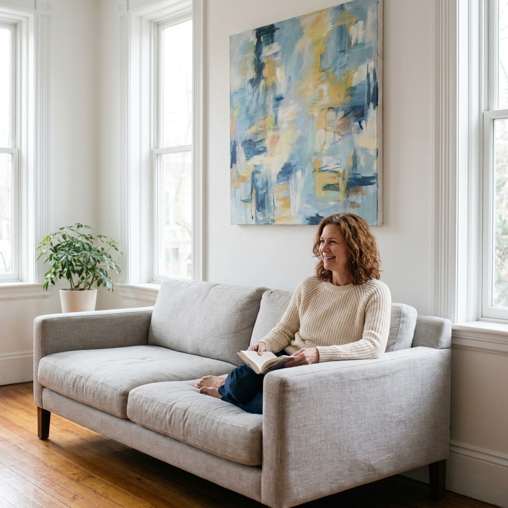
Step 1: Read the room
Before you buy a single frame or pick up a hammer, do a slow lap around your space. Modern design is often about negative space, and negative space is not emptiness. It is pacing.
Find your lead actors
Every room has one or two architectural or functional anchors. In a living room, it might be the sofa wall or the fireplace. In a dining room, it is usually the long wall that sits behind the table. In a hallway, it is the sightline you see the moment you turn a corner.
- Choose one primary art moment per room where the best piece gets the most visual oxygen.
- Choose one supporting moment where smaller work can echo the mood without competing.
Notice light, glare, and traffic
Fine art and sunlight have a complicated relationship. If a wall gets direct sun for hours, plan on UV-filtering glazing , and consider anti-reflective options if glare is an issue. Product names vary by brand, and not every "museum" labeled glass includes the same UV rating or anti-reflective coating, so check the specs.
Also pay attention to where people walk. If coats, bags, or chair backs will constantly graze the wall, keep fragile surfaces out of harm’s way.
One more conservation-minded note: heat and grime are quiet villains. Avoid hanging valuable or delicate works above radiators, working fireplaces, or in splash zones near stoves and sinks. Steam, grease, and temperature swings add up faster than you think, especially for works on paper.
Step 2: Choose the right work
In clean-lined interiors, art tends to read more graphic because the surroundings are so crisp. That can be wonderful if you lean into it.
Start with scale
The most common mistake I see is art that is simply too small. A modest piece can be exquisite, but it needs an intentional setting. Otherwise it looks like it got lost en route to the wall.
- Over a sofa or console: aim for art that spans about two-thirds to three-quarters of the furniture width.
- On a large blank wall: consider one large work, a diptych, or a tightly edited group. In pared-back spaces, a single strong piece often reads more designed than many scattered ones.
Connect one thread
You do not have to match your painting to your pillows. Please do not. Instead, pick one subtle bridge between the art and the room:
- Palette echo: a single recurring color note, like rust, ultramarine, or ink black.
- Temperature echo: warm works with warm woods, cooler works with concrete, steel, and marble. Also remember your bulbs are part of the palette. A very warm lamp can make cool art look moodier, and a cool LED can flatten warm neutrals.
- Texture echo: a heavily worked surface plays beautifully with linen upholstery, boucle, raw plaster, or matte cabinetry.
Balance polish with something human
Modern rooms can be pristine. Art is where you can invite a little weather, a little vulnerability. A charcoal drawing with visible hand pressure. A painting that shows its revisions. A photograph with grain. These details keep the space from feeling like a showroom.

Step 3: Edit with intention
Collecting is romantic. Hanging everything you own at once is not. The secret to high-end display is rarely the price tag. It is the edit.
Try the three-work test
If you are building a small collection, start by choosing three pieces that can coexist:
- One anchor: the boldest, largest, or most emotionally direct work.
- One counterpoint: different medium, different tempo, something that creates conversation.
- One quiet piece: a drawing, photograph, or subtle painting that gives the eye a resting place.
Concrete example, if you want one: an overscale abstract canvas (anchor), a crisp black-and-white photo (counterpoint), and a small ink drawing with a generous mat (quiet). This trio can migrate from room to room as you learn what your space wants.
Give the best piece the best wall
Not every wall deserves art. A wall with awkward switches, vents, and a thermostat cluster is not a tragedy. It is a sign to pivot. Put art where it can be seen without visual clutter interrupting it.
Step 4: Frame and glaze
Framing is not an afterthought. In modern spaces, frames are like typography. They decide the tone of the whole sentence.
Simple frames, real choices
- Black or dark-stained wood: crisp, graphic, confident. Great with photography and modern works on paper.
- Natural oak or maple: softens minimalism and adds warmth without going traditional.
- White frames: can look stunning on colored walls, but on white walls they need strong matting or a substantial profile to avoid disappearing.
- Floater frames for canvas: ideal for contemporary paintings. They keep the edges visible and make the work feel architectural.
Matting is breathing room
For works on paper, a mat is not just decoration. It is space. In a modern interior, I often prefer generous mats because they make small works feel important.
Glazing that fits your light
If you can, choose UV-filtering glazing. If reflections are an issue, look for anti-reflective glazing (sometimes marketed as museum glass or AR glass depending on brand). It is one of the few upgrades that instantly makes art look calmer and more present.
One small caveat for the truly detail-obsessed: some anti-reflective products can add a faint tint or slightly change perceived contrast. Ask to see a sample in your room’s lighting before you commit, especially for high-gloss photos and very dark works.
Step 5: Plan the hang
This is where we shift from taste to craft. You can have a brilliant eye and still end up with a wall that feels off if spacing and height are inconsistent.
Use gallery height
Many galleries and museums often hang so the center of the artwork sits around 57 inches from the floor (sometimes closer to 58 to 60 inches depending on the institution and the collection). In a home, adjust for your life:
- If you mostly stand in the space (hallways, kitchens), stay close to that range.
- If you mostly sit (living rooms, dens), you can drop a little so the work meets you where you are.
Over furniture: mind the gap
For art above a sofa, bed, or console, a reliable starting point is 6 to 10 inches above the furniture. This is a guideline, not a law. High ceilings, tall headboards, very large art, or low-slung sectionals may push you slightly up or down. The goal is simple: the art should feel tethered to the furniture, not hovering.
Map it with paper
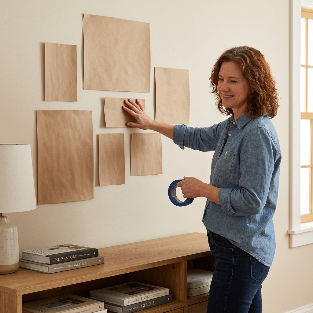
My favorite low-drama method: trace each frame onto kraft paper or newspaper, cut it out, and tape it to the wall. Live with it for a day. Walk past it in morning light and evening lamp light. Adjust before committing.
Step 6: Hang safely
Walls can hide surprises: drywall that crumbles, metal studs, plaster, concrete, or that one spot where nothing holds because the building has opinions. If the work is valuable or heavy, treat the hardware like part of the investment.
Hardware basics
- Use two hooks for wide frames to prevent tilting and to distribute weight.
- Use anchors rated above the weight of the piece, not equal to it.
- For masonry or concrete: use the correct drill bit and fasteners designed for that wall type.
- For very heavy work: consider a French cleat system. It is clean, secure, and sits nicely in contemporary settings.
Protect the wall and the frame
- Add felt bumpers to the bottom corners to keep frames level and prevent scuffs.
- If you live somewhere humid, or you are hanging on an exterior wall, avoid sealing art tight to the surface. A little airflow can help reduce moisture risk. Think of this as conservation-minded advice, not a universal rule. Buildings vary.
If you are dealing with a very large piece, fragile glazing, a high-value original, or tricky wall materials (old plaster, tile, concrete), it is worth calling a professional installer or a reputable framer for guidance. This is not the moment for improvisation.
Step 7: Arrange cleanly
Modern interiors love intention. The layout should feel structured, even if the art itself is wild.
Three layouts that work
- The single statement: one large piece centered on a wall, with breathing room on all sides. Clean. Confident.
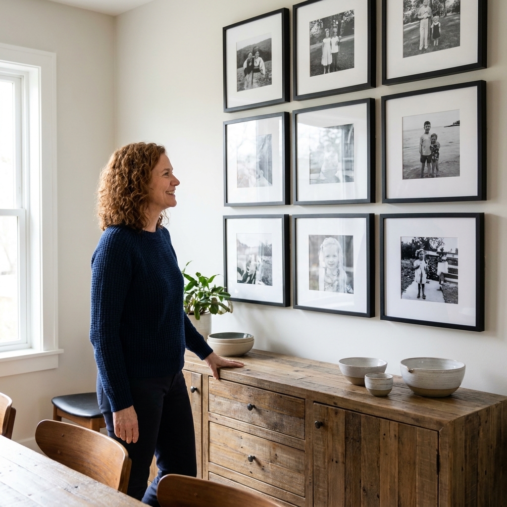
- The grid: same-size frames in a tidy matrix. Perfect for photography series, prints, or works on paper.
- The salon wall with rules: mixed sizes, but with one consistent element (frame color, mat size, or equal spacing). This keeps it from turning chaotic.
Spacing that reads premium
Pick a spacing distance and stick with it. For most gallery walls, 2 to 3 inches between frames feels crisp. Wider spacing can work in very large rooms, but inconsistency is what makes a wall look accidental.
Mind the edges
In clean architecture, edges matter. Align the outside edges of frames with something already in the room: the edge of a rug, the line of a console, the height of a door frame. These quiet alignments are the difference between hung and integrated.
Step 8: Light it well
Lighting is the gentle magician of art display. It can make a good piece look extraordinary, and it can make an extraordinary piece look tired.
Choose a lighting approach
- Track lighting: flexible and clean for open-plan ceilings.
- Picture lights: classic, but can still feel contemporary if you choose a slim profile in brass, bronze, or black.
- Wall washers or recessed spots: subtle, architectural, and lovely for large statement pieces.
Avoid glare and hotspots
Angle lights so reflections do not hit the viewer’s eye line. If your art is glazed, a small change in angle can make the difference between seeing the work and seeing yourself.
If you are collecting works on paper or textiles, consider LEDs and keep intensity moderate. Art likes a soft, steady life.
Step 9: Make it lived-in
The most beautiful modern homes I have been in always have one thing in common: the art looks like it belongs to a person, not a checklist.
Pair art with objects
A console beneath a piece can hold a few well-chosen companions: a ceramic vessel, a small stack of books, maybe a sculptural object. Keep the number low. Let the art stay in the lead.
Lean sometimes
Leaning a framed work on a shelf or a low ledge can soften a rigid space. It also gives you flexibility as your collection changes. Just keep it stable and away from high-traffic corners.
Common mistakes
- Hanging too high: art should converse with people, not with the ceiling.
- Too-small work on a huge wall: either scale up or give it a deliberate moment with a light, a bench, or a tight grouping.
- Frames that fight the piece: the frame should support the work’s voice, not shout over it.
- Ignoring lighting: even the perfect hang can fall flat without considerate illumination.
- Overcrowding: modern interiors crave breath. Let silence be part of the composition.
Room cheat sheet
Living room
- Choose one strong anchor piece for the main seating wall.
- Keep the bottom edge close enough to furniture to feel connected.
- Use two-point hanging to prevent shifting.
Bedroom
- Consider calmer work, or at least calmer color temperature.
- Hang slightly lower if the art is meant to be enjoyed from bed.
- A pair of smaller works can feel more restful than one very busy composition.
Hallway
- Go for rhythm: a series, a grid, or evenly spaced singles.
- Mind glare from overhead fixtures.
- Keep frames flatter if the corridor is narrow.
Dining room
- Choose art that can hold its own against a long table.
- Consider a diptych or triptych for a wide wall.
- Lighting matters here because dinner is usually evening light.
FAQ
How high should I hang art?
As a baseline, hang so the center of the piece sits around 57 inches from the floor (often adjusted into the 58 to 60 inch range). Then tweak based on whether you mostly stand or sit in that room.
Should I match the art to my decor?
No. Aim for resonance, not matching. Let one element connect, like a repeated color note or a shared texture. The room should feel like it is hosting the art, not dressing up as it.
What is the best way to make a clean gallery wall?
Pick one rule and honor it: consistent frame color, consistent spacing, or a grid. Plan with paper templates first, then hang with measured gaps.
Can I mix contemporary art with antiques?
It is not only okay, it is often the most soulful choice. A clean room with one vintage frame or a small antique object nearby gains depth immediately. The trick is to keep the grouping edited so the contrast feels intentional.
Curating a home is not about filling walls. It is about deciding what you want to look at, day after day, and giving it the dignity of good placement.
If you take nothing else from this: choose fewer pieces, give them more space, hang them at human height, and light them with care. Modern architecture will do the rest, like a well-built stage waiting for a voice.