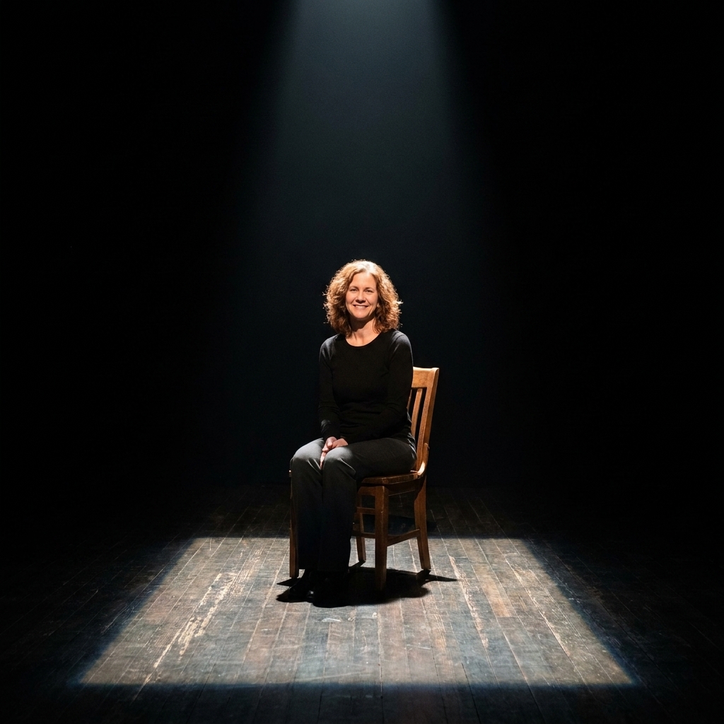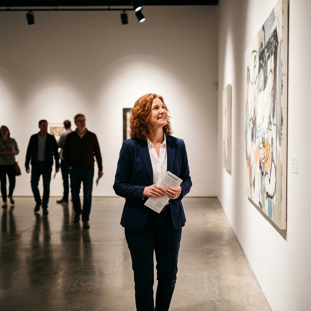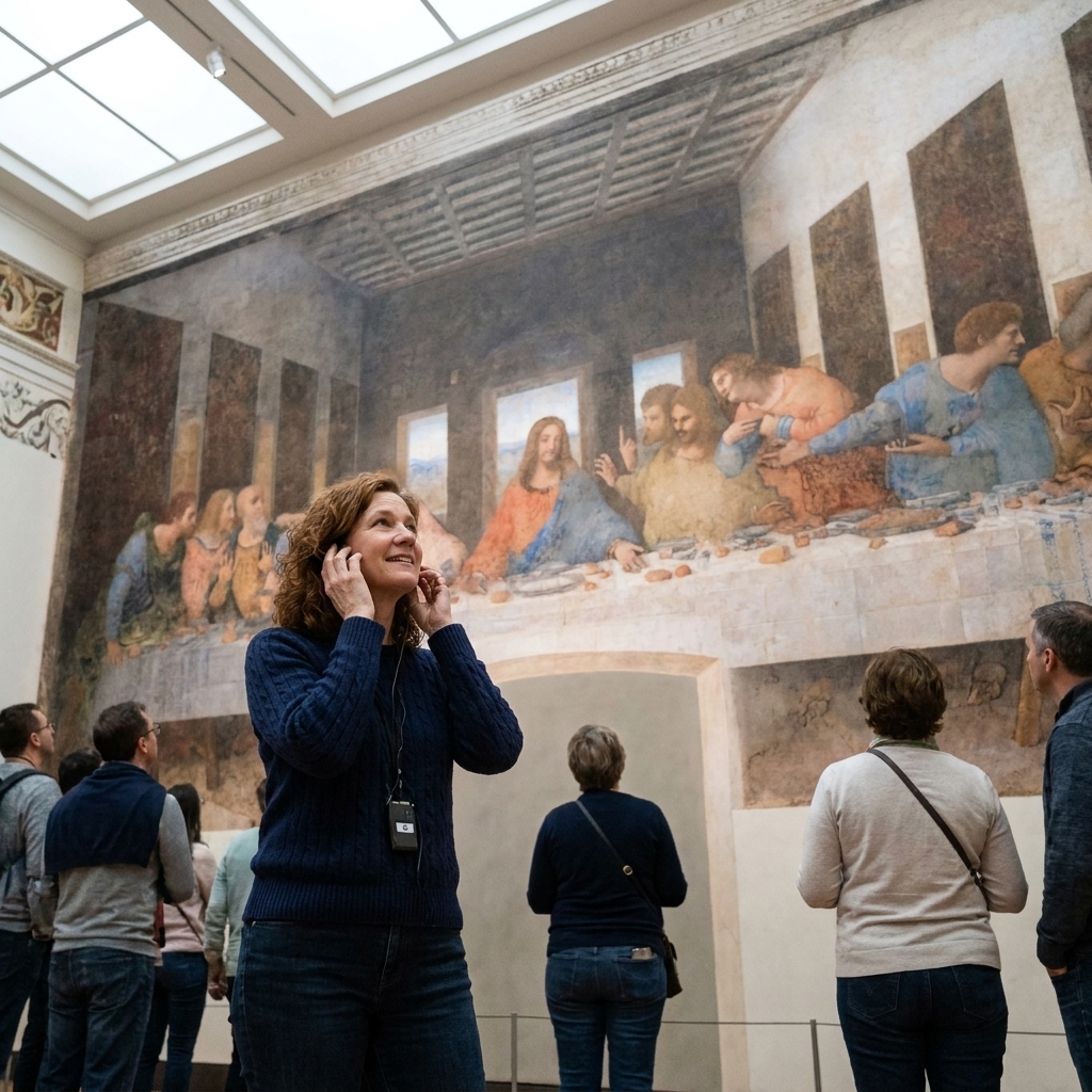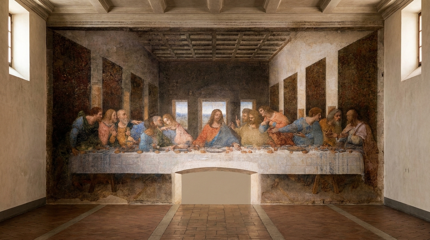
Minimalism and maximalism get treated like opposing teams, as if you have to pledge allegiance and never look back. But in galleries and theaters, I learned a quieter truth: aesthetics are tools, not identities. A sparse stage can feel like a cathedral. A crowded canvas can feel like a confession. In high-end visual design, the difference is rarely “less vs. more.” It is what you want the viewer to feel first, and what you invite them to discover second.
Here is what each philosophy is actually doing, why it can read as “luxury” (or not), and how to apply either one without falling into the most common traps.
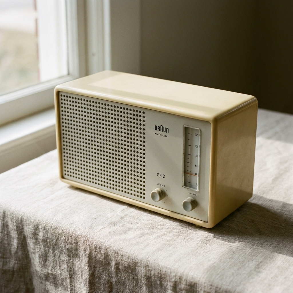
Two styles, two promises
Minimalism: clarity
Minimalism is a commitment to editing. It says: I know what matters, and I trust you to sit with it. In practice, minimalist design reduces elements so the remaining ones can speak at full volume: a single typeface with generous spacing, a limited palette, a hero image that has room to breathe.
In fine art terms, think of Agnes Martin’s grids or Donald Judd’s precise repetition. The impact is not in decoration. It is in proportion, material, and attention.
Maximalism: abundance
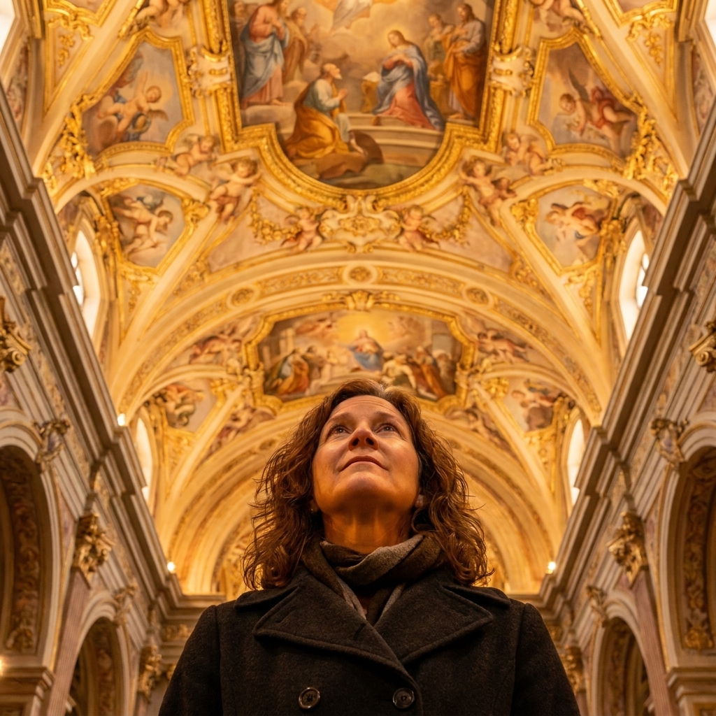
Maximalism is a commitment to layering. It says: there is more here than you can take in at once, and that is the point. In practice, it embraces pattern, contrast, ornament, collage-like composition, and expressive typography. It is often narrative. It is frequently sensual.
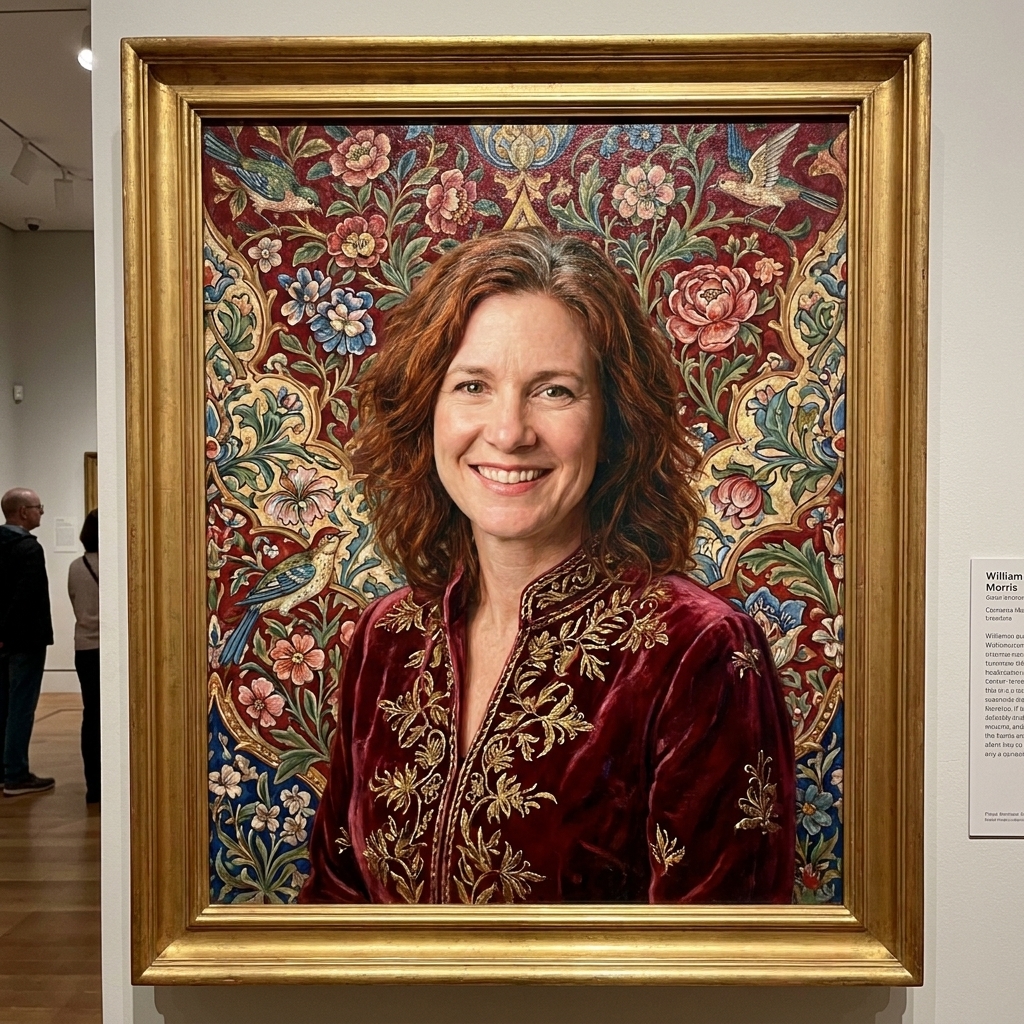
In fine art terms, you might think of Kehinde Wiley’s ornate botanical backdrops, or the immersive density of a Baroque ceiling where every inch participates in the drama.
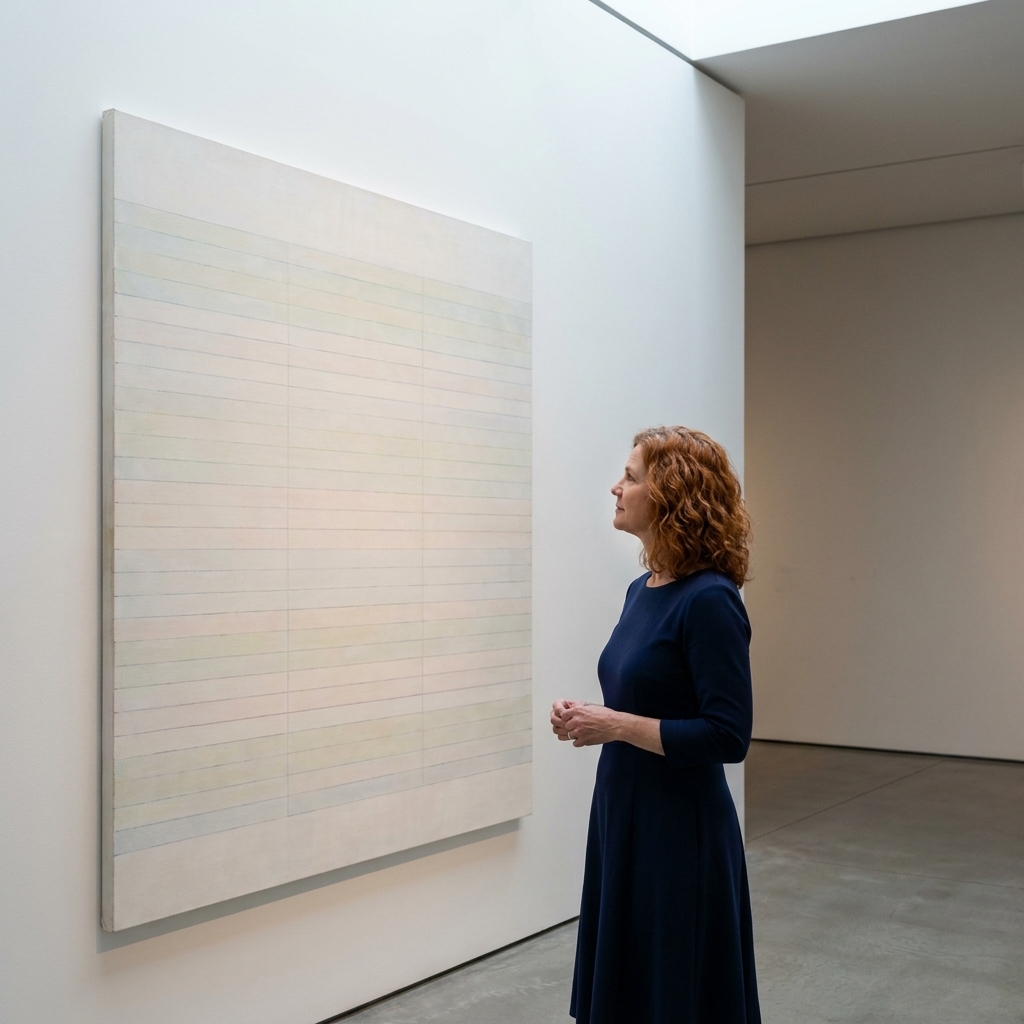
Why both can feel expensive
Luxury is not a style. It is a sensation. And that sensation often comes from control.
- Minimalism reads as high-end when the details are impeccable: typography is sharp at every size, spacing feels intentional, photography is immaculate, and materials feel tactile. It whispers, “nothing here is accidental.”
- Maximalism reads as high-end when the complexity has hierarchy: your eye is guided, the palette is orchestrated, and the density feels curated rather than chaotic. It says, “we have so much, and we know exactly where to place it.”
The cheaper version of either aesthetic is the same failure in two costumes: lack of care.
Minimalism, done well
When it fits
- When the work is the star. If you are presenting art, jewelry, architecture, couture, or any object where surface and craft matter, minimalism is a respectful frame.
- When trust is your currency. Museums, high-end wellness, finance, and heritage brands often benefit from a calm, measured visual tone.
- When the viewer needs speed. Minimalism can be an act of generosity on small screens. Less scanning, more understanding.
Toolkit
- White space as structure. Not emptiness, but pacing. Like pauses in music.
- One dominant gesture. A single arresting image, a sculptural headline, a bold block of color.
- Restrained palettes. Neutrals plus one accent, or a tight range of tones.
- Typographic discipline. Few styles, consistent scale, generous leading, intentional alignment.
Where it fails
- It becomes sterile. If everything is gray, thin, and quiet, the design can feel like it is afraid of being felt.
- It leans on clichés. Beige palettes, ultra-thin sans serifs, and vacant stock photography can read less “gallery” and more “generic tech lobby.”
- It exposes weak assets. Minimalism is often unforgiving. If your photography, copy, or product styling is soft, there is nowhere to hide it.
- It misses accessibility. Low contrast, hairline weights, and tiny type can look “refined” and still be unreadable. Luxury should not require squinting.
Maximalism, done well
When it fits
- When you have a story. Editorial projects, festivals, performance seasons, and cultural campaigns thrive on layered meaning.
- When you want to signal worldliness. Maximalism can communicate taste, collecting, travel, and a life lived among objects and references.
- When you need memorability. If your category is visually bland, maximalism can be a flag planted in the landscape.
Toolkit
- Pattern and ornament with purpose. Motifs that connect to the brand’s provenance, medium, or mood.
- Layered typography. Display type plus a dependable workhorse, with scale shifts that create rhythm.
- Color as emotion. Rich contrasts, unexpected combinations, and deliberate saturation choices.
- Texture and material cues. Grain, fabric, paper, brush, metal, lacquer. Even digitally, you can suggest touch.
Where it fails
- It loses hierarchy. If everything shouts, the viewer cannot hear the message.
- It confuses “busy” with “bold.” Boldness has direction. Busy is just noise.
- It gets inconsistent. Maximalism still needs rules. Without a system, it reads as a mood board that escaped.
- It forgets accessibility. Visual richness still needs legible sizes, strong contrast, and a clear reading order. If motion is involved, offer reduced motion options.
How to choose
Start with first feeling
- Do you want them to feel calm, assured, and focused? Lean minimalist.
- Do you want them to feel intrigued, energized, and pulled inward? Lean maximalist.
Then decide what must land fast
High-end design is sometimes mistaken for “mysterious.” Mystery can be beautiful, but confusion is costly. Decide what is non-negotiable at a glance: name, offering, date, location, price point, or next action.
- If the essentials are complex, use minimalist structure to keep effort low.
- If the essentials are simple, you have room for maximalist theater.
Check your assets
- Outstanding photography or product craft? Minimalism will elevate it.
- Rich archives, illustration, typography, or cultural references? Maximalism can activate them.
- Mixed-quality assets? Consider a hybrid approach with strict hierarchy.
Remember context
“Luxury cues” are not universal. Minimalism can read as contemporary, clinical, or even sparse depending on region and category. Maximalism can read as celebratory, traditional, or excessive depending on the same. Design for your audience, not for a global mood board.
Hybrid: quiet + drama
Some of the most sophisticated work lives in the in-between. Not compromise, but choreography.
Three hybrid recipes
- Minimal layout, maximal image. A restrained grid, lots of breathing room, then one lush, detailed artwork or photograph that carries the emotion.
- Maximal typography, minimal palette. Play with expressive type scales and placements while keeping color tightly controlled.
- Minimal base, rich detail up close. From a distance it reads calm. On second glance, you find embossing, micro-patterns, nuanced texture, or subtle motifs.
Think of it like tailoring: the silhouette can be simple, but the fabric can be astonishing.
Mini examples
Example 1: a minimalist art sale
Goal: Sell a limited edition print without competing with the work.
- Grid: One-column layout with generous margins and a calm baseline rhythm.
- Type: One serif for headlines, one neutral sans for details. Two weights max. No letterspacing gimmicks.
- Color: Warm white, charcoal text, one muted accent pulled from the artwork.
- Imagery: One hero crop, then a second image for texture or signature detail.
- Accessibility: Contrast stays strong, body text stays comfortably sized, and the call to action is unmistakable.
Example 2: a maximalist festival poster
Goal: Create immediacy and energy for a multi-venue performance weekend.
- Grid: Modular grid that allows overlap, but keeps date, city, and ticket URL in fixed positions.
- Type: One expressive display face for the festival name, one highly legible sans for schedule and venue list.
- Color: Two or three core hues with one bright “signal” color reserved for the date.
- Motif: A recurring pattern that changes scale across formats, so it feels collectible rather than random.
- Accessibility: The main message is readable at distance, small text meets contrast standards, and any animated versions honor reduced motion.
Example 3: a hybrid luxury skincare launch
Goal: Keep ecommerce calm while letting campaign imagery carry desire.
- Product pages: Minimal. Clean grid, lots of whitespace, sharp type, clear ingredients and instructions.
- Campaign: Maximal. Lush botanicals, tactile macro photography, richer color, more expressive layout.
- Throughline: A consistent typographic system and a repeatable lighting style, so the two modes feel like one brand.
What matters most
Hierarchy
Whether sparse or abundant, the eye needs a path. Decide what is primary, secondary, and tertiary, then commit. Scale, contrast, and spacing are your ushers.
Consistency
Luxury brands and cultural institutions feel coherent across touchpoints. Choose a system: type rules, color rules, image treatment rules, and repeat them until they become a signature.
Materiality
Even on screen, “material” can be suggested through light, shadow, texture, and photographed surfaces. On print, it is everything: paper stock, ink density, embossing, foil, stitching. Minimalism becomes sumptuous when materials do more of the talking. Maximalism becomes refined when materials keep it from feeling disposable.
Restraint
Restraint is not exclusive to minimalism. A maximalist composition can be restrained in palette. A minimalist layout can be bold in contrast. Restraint is simply knowing when to stop.
Common picks
- Museum exhibition identity: Minimal structure with a maximal hero artwork crop, plus typography that can flex across banners, labels, and programs.
- Avant-garde theater season: Maximalist poster language with strong typographic hierarchy, then a simplified website layout so tickets are effortless to buy.
- Luxury skincare launch: Minimalism for packaging and ecommerce, maximalism reserved for campaign imagery where mood and desire can bloom.
- Collector’s book or catalog: A quiet grid that respects the work, with occasional rich inserts like fold-outs, patterned endpapers, or lush section openers.
Quick gut-check
For minimalism
- Can you explain what this is in one breath?
- Do your type sizes and spacing feel intentional rather than default?
- Is there at least one moment of warmth, humanity, or texture?
- Is contrast strong enough to read comfortably in real conditions?
For maximalism
- Can a viewer find the main message in three seconds?
- Do you have a limited set of rules for color, type, and motif?
- Does the density feel curated rather than crowded?
- Is the reading order clear, with legible type and sensible contrast?
FAQ
Is minimalism still “in” for luxury?
Yes, but the version that lasts is not blankness. It is precision. Luxury minimalism is about proportion, materials, and superb imagery, not removing personality.
Does maximalism always hurt usability?
Not if hierarchy is strong. You can be visually rich and still be clear. The trick is to decide what the eye should land on first, then design everything else to support that landing.
Can a brand switch between minimalism and maximalism?
Absolutely, as long as the underlying identity stays consistent. Many high-end brands do minimal product pages and richer campaigns. Think of it as changing the lighting, not changing the play.
Closing note
If minimalism is a well-lit gallery wall, maximalism is a salon hang where the paintings climb toward the ceiling. Both can be exquisite. Both can be careless. The difference is whether you are making choices with intention, or simply picking a vibe and hoping it holds.
Choose the aesthetic that serves the work, the audience, and the moment. Then make it sing.