Impressionist color is often mistaken for “pretty pastel.” But stand close to a Monet and you will see something braver: color as a way of thinking. Light is not a spotlight laid over objects. Light changes objects, and the painters who chased it learned to build palettes that can hold a shifting sky, a flicker of water, a cheek warmed by late afternoon, all without turning chalky or lifeless.
This is a hands-on tutorial for visual artists and designers who want a distinctive palette, not a borrowed one. We will steal the right things from the masters: how they grouped values, how they used complementary contrast to make light vibrate, and how they kept neutrals alive.
Start with light, not local color
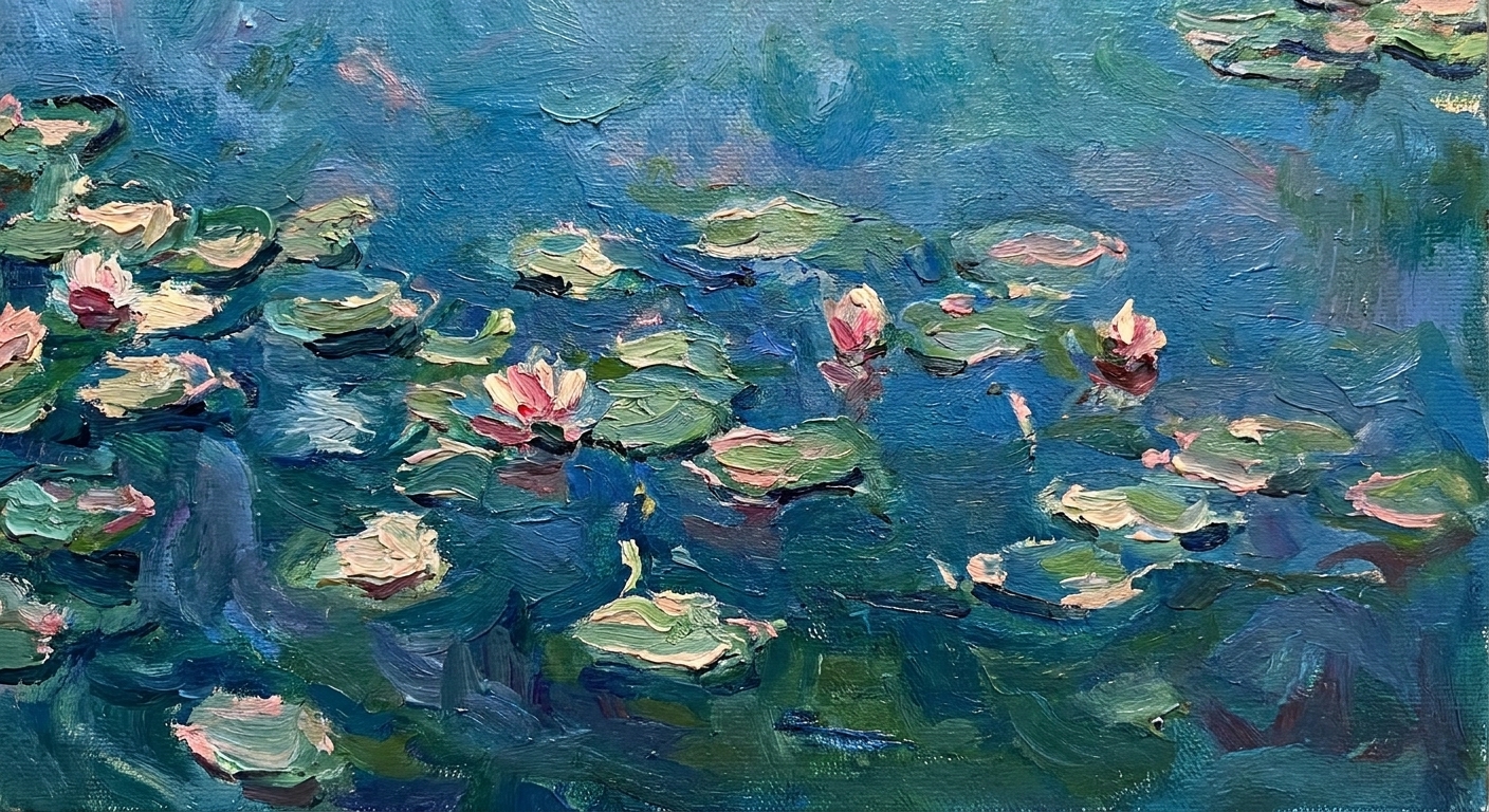
If you only take one idea from Impressionism, let it be this: a “green tree” is rarely just green. It is green warmed by sun, cooled by shadow, softened by haze, and interrupted by reflected colors from everything around it.
Before you pick colors, pick your light.
- Time of day: morning (cool, crisp), midday (strong sun can flatten local color; distance still desaturates through atmosphere), late afternoon (warm highlights, long cool shadows), twilight (compressed values, dreamy transitions).
- Weather: clear (stronger complementary contrasts), overcast (muted chroma, subtle temperature shifts), fog or mist (value compression and atmospheric blues).
- Subject distance: near (more texture, sharper color shifts), far (less contrast, cooler and lighter distance).
In practice: write a single sentence that describes your light as if you are describing it to a friend waiting outside the museum. “A milky, overcast morning that turns everything into soft pearl” is a better palette brief than “pastels.”
Build your palette in layers
Impressionist paintings feel expansive because they are organized. Under the fluttering brushwork is a simple structure: values first, then temperature, then accents.
Layer 1: Value spine (4 to 6 steps)
Value is your palette’s skeleton. If the skeleton is solid, you can take more color risks without collapsing into chaos.
- Choose 2 light values for sunlit planes and sky.
- Choose 2 mid values for local color and atmosphere.
- Choose 1 to 2 dark values for anchors, not outlines.
Many Impressionists often avoided black, leaning instead on chromatic darks, though there are exceptions across artists and periods. If you are a designer, treat this as your grayscale system. If you are a painter, treat it as your underpainting logic.
Layer 2: Temperature pairs
Now make each value step bilingual: one warm, one cool. This is how you get that shimmering sensation without adding more colors than you can control.
- Warm light: creamy ivory, peach, straw yellow.
- Cool light: pale blue, blue-gray, mint-tinted white.
- Warm mid: soft terracotta, warm olive, muted gold.
- Cool mid: slate blue, cool green, lavender-gray.
- Warm dark: deep umber, wine, warm charcoal.
- Cool dark: indigo, blue-black, pine-shadow green.
Layer 3: Accent sparks (2 to 3 colors)
This is the part everyone notices and almost everyone overuses. Accents are not confetti. They are the few notes that make the whole composition ring.
Impressionists often placed small, high-chroma touches where the eye should rest. Think of a bright orange stroke near a cool blue shadow, or a clean rose note inside a sea of softened greens.
A concrete 9-color example
Try this “harbor afternoon” set and adjust temperature to match your light.
- Lights (3): warm ivory, cool mist blue, pale peach highlight.
- Mids (3): sage green, blue-gray slate, bridge neutral (pearl gray with a violet lean).
- Darks (2): cool indigo, warm umber.
- Accent (1): coral.

Use complementary contrast
Complementary pairs are a common engine in Impressionist palettes: blue against orange, red against green, yellow against violet. The magic comes from how they are paired and how gently they are tuned.
Rule: one loud, one quiet
Pick which color gets to be vivid and which one gets to be softened. If both are screaming, your palette feels synthetic.
- Vivid blue plus a muted orange (think terracotta, not traffic cone).
- Vivid green plus a dusty red (think brick, not pure crimson).
- Vivid yellow plus a smoky violet (think mauve-gray, not royal purple).
Try the broken complement
Instead of placing exact opposites, split one side into its neighbors. Example: rather than blue and orange, try blue with a mix of yellow-orange and red-orange. This keeps vibration without turning harsh.
Vibration, edges, and simultaneous contrast
That “vibrating” effect is often simultaneous contrast: neighboring colors push and pull each other in your eye. Keep edges selective. Let some transitions dissolve (especially in mid-values), then sharpen one or two edges where you want focus. The palette stays lively, and the composition stays legible.
Design translation
If you are building a brand palette, complements are wonderful for calls to action and focal points. The Impressionist trick is to reserve contrast for meaning. If everything is a button, nothing is.
Also, do not rely on hue alone for hierarchy. Check contrast (WCAG for text and UI) so your “value spine” holds up in real use, not just in a moodboard.
Keep neutrals alive
Neutrals are where Impressionist palettes become distinctive. Not dead grays, but colored grays that feel like air.
Think atmospheric neutrals
A good Impressionist neutral usually leans somewhere:
- Pearl gray that tips blue for mist.
- Mushroom taupe that tips violet for shadow.
- Stone beige that tips yellow for sunlit walls.
- Green-gray that suggests foliage in distance.
In painting, build these with complements rather than black and white alone. In digital work, sample from real scenes and then nudge temperature gently. You are aiming for “weather,” not “office carpet.”
Exercise: one light moment
This is my favorite way to develop a palette that feels like you, not a museum gift shop postcard.
Step 1: Pick one reference
Use a photo you took, a still from a film, or a painting detail. Pick something with atmosphere: reflections, haze, dappled shade, stage lighting. Avoid flat, evenly lit images.
Step 2: Limit to 9 colors
Nine is enough to feel rich and few enough to force decisions.
- 3 lights (include a warm and a cool light)
- 3 mids (one can be a “bridge” neutral)
- 2 darks (warm dark and cool dark)
- 1 accent (the emotional punch)
Step 3: Check in grayscale
Convert your swatches to grayscale. If your lights and mids collapse into the same value, you will struggle to show sunlight. If your darks are too close, you will lose structure.
Step 4: Add a complementary echo
Whatever your accent is, add a whisper of its complement somewhere in the mids. Example: if your accent is coral, add a tiny note of blue-green in a mid-tone neutral. This is what makes palettes feel intentional rather than decorative.
Step 5: Make a quick study
Make something small and fast: a 20-minute color sketch, a single poster layout, a UI card set. The goal is to see your palette under pressure.
Monet vs. Renoir
When people say “Impressionist palette,” they often mean two different temperaments. Try both and see which one feels closer to your hand.
Monet mood
- Strengths: luminous cools, subtle shifts, shimmering surfaces.
- Palette habits: often many related blues and blue-greens, lilac-tinted shadows, highlights that are not pure white.
- Try this: choose one dominant cool family (blue-green, for example) and build 60 to 70 percent of your palette inside it, then add a restrained warm accent.
- Note: Monet frequently used broken color and optical mixing, but it is best understood as a tendency and a tool, not a rigid rule.
Renoir mood
- Strengths: rosy warmth, honeyed light, lively complements that feel human.
- Palette habits: peaches and warm creams, greens that lean yellow, blues used as cooling relief.
- Try this: start with warm lights (ivory, apricot) and let your cools show up mainly in shadows and background structure.
Common mistakes
Everything is pastel
Fix: deepen your dark anchors and strengthen one mid-tone. Impressionist softness is usually edge softness, not value sameness.
Muddy shadows
Fix: cool your shadows and simplify them. Choose one shadow family (blue-violet, for example) and stick to it. Let warm notes appear as reflected light, not as random mixing.
Too many accents
Fix: choose one hero accent and demote the rest into quieter cousins. A single saturated note will look more saturated if it is surrounded by intelligent neutrals.
Pure black and pure white everywhere
Fix: tint your whites and build your darks from deep color. Even a small shift, ivory instead of white or indigo instead of black, makes your palette feel lived-in.
Make it yours in 30 days
Distinctive palettes are not found. They are practiced into existence.
Week 1: One subject, five lights
Paint or design the same simple subject (a cup, a face, a room corner, a landing page hero) in five different light moods. Keep your palette to 9 colors each time.
Week 2: One complement pair
Choose a complement pair you love (blue-orange is a classic) and build four different palettes around it by changing only the neutrals. Watch how the entire emotional register shifts.
Week 3: Steal structure
Pick an Impressionist you admire and analyze their value grouping: where are the light masses, mid masses, dark anchors? Build your own palette on the same value plan, but with different hues.
Week 4: Build a weather library
Create swatches named after feelings and conditions rather than pigments: “rainy window,” “summer dust,” “stage spotlight,” “harbor morning.” This is how palettes become yours. They stop being colors and start being memories you can reuse.
Quick FAQ
Do I need Monet’s or Renoir’s pigments?
No. Some historical pigments have modern substitutes for safety and stability. What you are really borrowing is their logic: value planning, temperature shifts, and controlled complementary contrast.
How many colors should a palette have?
For most projects, 7 to 12 is the sweet spot. Fewer forces cohesion. More invites confusion unless your value structure is extremely disciplined.
How do I avoid a vintage look?
Use the same principles with contemporary restraint: limit accents, keep neutrals crisp, and let one bold contrast carry the “now.” Impressionism is not a sepia filter. It is a way of seeing.
Is this useful for digital design?
Very. Think in systems: value spine (accessibility and hierarchy), temperature pairs (depth and mood), and accents (interaction and emphasis). Atmospheric neutrals are especially powerful for backgrounds and surfaces. Always confirm text and CTA contrast with a checker, because beautiful hue relationships do not guarantee readability.
If you want a palette that feels like Impressionism, stop asking “what color is this object?” and start asking “what is the light doing to it?” That question will keep your work honest.
When you are ready, make one small study today. Pick a light moment. Choose nine colors. And let your neutrals do some of the talking. The Impressionists were not chasing prettiness. They were chasing the way a real afternoon moves.