Art Deco is the rare style that can whisper luxury without raising its voice. Formally introduced to the world at the 1925 Exposition Internationale des Arts Décoratifs et Industriels Modernes in Paris and refined through the 1930s, it took the modern era’s new materials, new skylines, and new speeds and turned them into a visual language of confidence. If your brand wants to feel premium, intentional, and a touch cinematic, Art Deco offers a toolkit that is surprisingly adaptable.
The trick is to borrow the elements, not the era as a costume. Below are five influential Art Deco moves you can translate into contemporary visual branding, plus practical ways to use each one across logos, packaging, web design, and social templates. (And a quick note: Deco looked different in different places. Parisian Deco often leaned into luxe craft and ornament, while American Deco in the skyscraper age pushed verticality, speed, and streamlined geometry. You can borrow from either lane, or blend them.)

1) Engineered geometry
If Art Nouveau is a vine, Art Deco is a blueprint. Deco loves shapes that look designed rather than discovered: chevrons, zigzags, stepped forms, sunbursts, and crisp arcs that echo architecture and industrial craft.
How to use it in branding
- Pattern as a supporting actor: Build a repeatable motif from 1 to 2 simple shapes (a fan, a step, a thin diamond). Use it as a border on packaging, a watermark on invoices, or a subtle background texture behind product photography.
- Shape language in your layout: Bring in stepped frames for quotes, testimonials, or feature callouts. On the web, this can be as simple as corner treatments or section dividers that nod to Deco without shouting.
- Logo geometry: If you are refreshing a mark, experiment with symmetry and clean construction lines. Deco logos often feel like they could be drafted with a compass.
Make it modern
Keep the geometry spare. One strong motif used consistently reads premium. Five motifs competing for attention reads like a theme party invitation.

2) Controlled color
Art Deco color is not timid. Even when it is restrained, it feels deliberate: deep jewel tones, high-contrast neutrals, and the occasional creamy pastel. Think emerald and onyx, sapphire and ivory, oxblood and brass.
How to use it in branding
- Choose a “night out” neutral: Swap plain black for inky charcoal, espresso brown, or deep navy. These shades photograph beautifully and can reduce harsh contrast on screens.
- Pick one jewel accent: Emerald, cobalt, garnet, or amethyst can become your brand’s signature. Use it for buttons, small labels, pull quotes, and packaging seals.
- Design with contrast: Deco thrives on crisp light-dark relationships. Make sure your typography and call-to-action colors have strong contrast, especially on mobile.
A quick palette formula
70% deep neutral + 20% warm light neutral (cream, bone, parchment) + 10% jewel tone accent . Add metallics as a finish, not a flood.
Accessibility note
Keep legibility sacred. Avoid low-contrast pairings like gold-on-cream for body text, and sanity-check buttons and links against contrast guidelines before you fall in love with a palette.

3) Tall typography
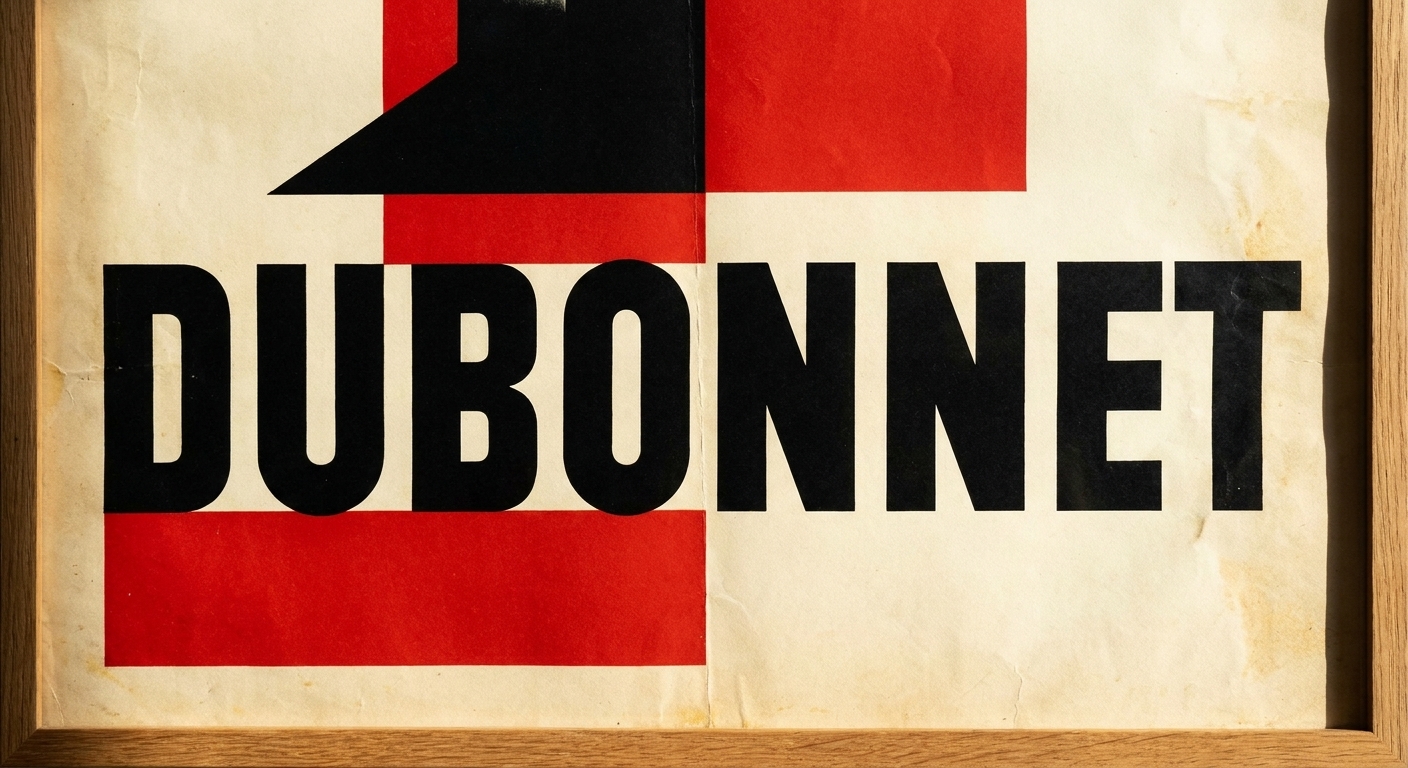
If there is one place Art Deco still feels instantly recognizable, it is type. Deco letterforms often stand tall, with clean geometry, sharp angles, and dramatic contrast. They feel like they belong on a lobby wall, not a sticky note.
How to use it in branding
- Pair a display face with a readable companion: Use a Deco-inspired serif or geometric display font for headlines and a simple sans serif for body text. Your readers should never have to squint for the sake of “vibes.”
- Let spacing do the luxury work: Deco design loves breathing room. Increase tracking slightly in all-caps headlines, and give your titles generous margins.
- Try monograms and lettermarks: Deco is naturally compatible with initials, especially for premium services, hospitality, beauty, spirits, or high-end retail.
Type pitfalls
- Over-stylized body copy: Save the dramatic font for short lines. Keep long paragraphs in something calm and modern.
- Too many typefaces: Two is usually plenty. Three is a careful exception.
4) Metallic finishes
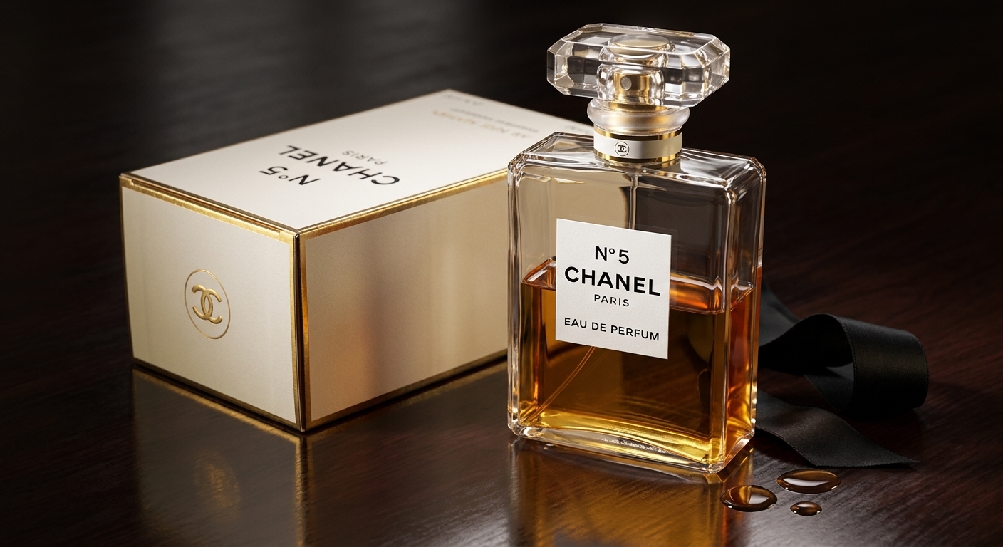
Art Deco is tactile at heart. It is the glint of brass on a door handle, the sheen of lacquer, the promise of a velvet seat. In branding, metallics and finish choices can carry that same message: this was made with care.
How to use it in branding
- Digital metallics: Use warm gold gradients sparingly for dividers, icons, or key highlights. Keep them subtle so they do not read like a gaming interface.
- Print upgrades: Foil stamping, embossing, debossing, and spot UV can translate Deco polish instantly on packaging, business cards, menus, and invites.
- Material cues: Even without special printing, you can suggest material through color and texture: cream paper tones, deep matte backgrounds, and sharp, clean lines.
Rule of thumb
Metallics work best as jewelry, not clothing. A thin gold keyline around a label can feel more expensive than a full gold background.
Accessibility note
Metallic ink and faux-gold gradients can reduce readability. Reserve them for accents and borders, and keep primary text and CTA labels in high-contrast, flat colors.
5) Symmetry and framing
Deco composition is confident. It stands upright. It centers itself. It frames the subject like an entrance to somewhere important. That sense of order is a gift for brand systems, especially when you need templates that scale .
How to use it in branding
- Build a hero frame: Create a reusable frame shape for product shots, founder portraits, or campaign images. Think rounded-arch windows, stepped borders, or a clean geometric outline.
- Lean into vertical formats: Deco loves tall proportions. In social, try vertical posters, elongated story layouts, and stacked type with strong hierarchy.
- Center your headlines: You do not need to center everything, but one centered headline style in your brand kit can deliver that Deco poster energy.
Keep it current
Balance symmetry with negative space and modern photography. Crisp, natural images keep the system from feeling like a period piece.

Putting it together
If you want the quickest, least chaotic way to test Art Deco in your visual branding, try this three-step mix for one campaign or product line:
- Start with geometry: Pick one motif (fan, step, chevron) and use it consistently as a border or background accent.
- Choose a jewel accent: Add one rich color that appears in buttons, tags, or small details.
- Upgrade the type: Introduce a Deco-leaning display font for headlines only, paired with a modern sans for everything else.
Then, if it still feels cohesive after two weeks of real use, bring in metallic finishes or expanded templates. Deco rewards restraint. It always has.
Two quick examples
- Cocktail bar promo: Deep navy base, one emerald accent, a sunburst corner motif, and a tall display headline for the drink name. Keep the menu copy in a clean sans serif with generous spacing.
- Skincare launch: Cream and charcoal palette with a thin brass keyline, a stepped label frame, and a simple monogram on the carton. Let the product photography stay modern and natural to avoid “period piece” vibes.
Do and don’t
- Do: Use one signature motif, one accent color, and one display type style.
- Do: Prioritize contrast and legibility, especially for CTAs and small text.
- Don’t: Put pattern on every surface and metallic on every element.
- Don’t: Use ornate type for paragraphs or long captions.
FAQ
Will Art Deco look dated?
Not if you treat it as a design language instead of a costume. Modern photography, clean spacing, and a limited palette keep the look current while letting the Deco cues communicate polish.
What brands benefit most?
Any brand that wants to feel intentional and high-end can borrow from Deco, but it is especially effective for hospitality, cocktails and culinary, beauty, jewelry, fashion, architecture and interiors, and cultural institutions.
How much is too much?
If every surface has a pattern, every headline has ornate letterforms, and every element is metallic, you lose hierarchy. Pick one primary Deco signal and two supporting ones. Let the rest of the system stay quiet.